SharePoint Governance – Debategraph style
Quick note: This is another of the sort of posts where I cannot help but feel that some readers will wonder what I have been smoking. It is not essential, but reading the “one best practice” series will provide a lot of background to this post.
 On the grand scale of world problems, your average messed up SharePoint project would not be considered particularly “wicked”. If you compare a haywire SharePoint project to the truly *global* wicked problems, such as global warming, the Israeli/Palestinian conflict and Tom Cruise, then it kind of makes you realise just how good we SharePoint architects, developers and engineers have it. I mean, hey, if a bunch of nerds can’t make little ol’ SharePoint a success, what hope do we have for the big issues like making Tom Cruise less of a tool?
I know some people who have left SharePoint architecture work because of all the “people crap”. If you think “people crap” is bad in IT, imagine trying to mediate between the myriad of stakeholders involved in, say, cuts to carbon dioxide emissions. That is a world of hurt that is so huge that it pains my brain just to imagine it.
Last year when I was learning the dark Jedi arts of dialogue mapping I got to know David Price, one of my fellow students who operated in that world of hurt. David is a very smart man indeed, with a Ph.D in organisational learning and environmental policy. His career has included public policy consultancy, TV documentary production, academic research and mediation.
It was during that training course that David introduced me to a joint venture that he started with another scarily smart man named Peter Baldwin. Peter is an Australian who had a 15 year career in national politics, including six years as a federal minister in the Australian government. Unlike many Australian pollies, his background was engineering. After leaving politics, with a keen interest in how the web could “raise the quality of debate about public policy issues,” he cranked out visual studio and got down to some coding.
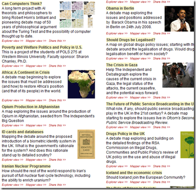
The “baby” from this collaboration between David and Peter is a unique tool called Debategraph and it is a very interesting tool indeed.
DebateGraph was conceived as a tool to improve the quality of public debate on contentious or complex issues. Public debate, in general, is usually pretty awful. David and Peter explain why this is the case pretty comprehensively below.
Public debates tend to be complex; with multiple data sources and perspectives and conflicting demands and values. In complex debates, the volume of information and arguments can seem like an overwhelming obstacle to someone, trying to develop a comprehensive understanding of the essential arguments advanced by all sides.
Public debate is all too often characterized by repetitive contributions, digressions, argumentative fallacies, rhetorical flourishes, manipulative framing, obfuscation and personal attacks that result in a high noise-to-signal ratio and confusion rather than clarity.
Conventional media reporting of public policy debates often struggles with the challenge of conveying nuanced, reasoned positions in a compressed linear form, when simple heated oppositions deliver a more dramatic and rewarding effect.
This, in turn, makes it harder for established public figures to think tentatively and creatively in public about new policy approaches and to acknowledge strengths and common ground in opponents’ positions.
We are talking about wicked problems here a lot of the time since public policy debates by definition respond to problems or questions where the general public are stakeholders. This means that there are a lot of varied stakeholders with even more varied world views and frames of reference. By creating a tool to improve the quality of a public policy discussion, DebateGraph is a tool that helps to deal with wicked problems themselves. What is interesting about DebateGraph is that like the IBIS based issue mapping that I practice, it is a visual, map based approach, yet it was developed independently from Conklin, Compendium or anything else in the space.
DebateGraph is a free online service. It allows the global community to collaboratively build maps of complex debates that accurately present all sides of the debate from a neutral standpoint, free of repetitive clutter and ‘noise’. Like a wiki, all aspects of the debate maps, both their content and structure, are continuously open to revision, refinement, comment, and evaluation by anyone who wants to join the community of thought. Each map is a cumulative work in progress.
Readers and editors of the maps can explore the top-level structure of debates and delve into specific strands or sub-structures of a debate. What interested me was the fact that the debate maps can be embedded into other websites; with changes made to the map on one site updating immediately across every site on which it appears.
DebateGraph also has RSS and email alerting like SharePoint, as well as a unique rating system where users can specify how much they relate to, or believe in a particular argument. The map then self reconfigures based on what arguments are considered the strongest. In effect, the map becomes a multi-dimensional poll or decision making tool.
“Although consensus can emerge from such a process, not least because it promotes the discovery of previously unidentified options, our hope is as much that the people who continue to disagree will do so on the basis of an enriched understanding of the reasons for their disagreement and having had the chance to test each other’s reasoning to the fullest.”
How DebateGraph works
Using DebateGraph is pretty easy, given that you can embed it into other web sites as I have done here in this post. From the hundreds of maps that I can choose, I’ve decided to embed the map of the global financial crisis for you to explore. Click on the bubbles below and move them around. You will find that like bubble-wrap, you will spend your first few minutes immersing yourself in moving nodes around and navigating here and there. Go ahead and have a play – I’m patient – I’ll wait for you 🙂
Right! I’m guessing around seven minutes have passed. Now that you’ve had a play, click on the first arrow, below the map and above the bottom toolbar. This will take you back to the top level financial crisis map. Let’s take a closer look at what is going on here.
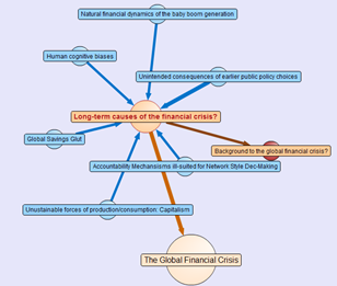
Attached to this “Global Financial Crisis” map is several root questions covering the cause, consequences, triggers and response to this problem. If you hover your mouse over any of the nodes, you will find a more detailed view of the question. Hover your mouse over the arrows between nodes, and you will find that the questions “arise from” the central “global financial crisis” node.
Also, note the thickness of the arrows between nodes. The width represents the importance placed on this node by the community of users that have developed this map.
The node colours are important too. Click on the “Long term causes of the financial crisis?” node above, and it will break out to a sub-map. Here the nodes are blue, rather than orange as shown below. The difference in colour is because these nodes are possible responses to the question “Long term causes of the financial crisis?” Once again, the width of the arrows indicate the community’s view of the validity of the responses. Now let’s look at a response that would potentially be divisive. One of the potential answers to the long term causes of the current crisis is “Natural financial dynamics of the baby boom generation.” So, it’s all the baby boomers fault, is it? 😉
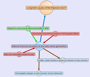
Clicking on the “Natural financial dynamics of the baby boom generation” and we see a map with a few different coloured nodes. This is because there are some supporting and opposing arguments to this idea. The green nodes support the idea and the red nodes oppose the idea. This is the essence of the pro and con type arguments used when you create IBIS maps.
There are also some other nodes where the direction of the arrow is the opposite to the ones we have examined so far. These are links to other maps, and if you highlight the outward arrows, you can see that our current map relates to nodes in completely separate maps.
This highlights a really important point about DebateGraph. It links related issues into a “web” of argumentation allowing readers to fully explore the myriad of interlocking issues that make up complex problems without “drowning” in information overload.
Contributing to debates
If you feel strongly on a particular subject then you are free to contribute to the debate. All DebateGraph maps have a toolbar that allows you to perform more advanced activities.
From left to right, the icons perform the following tasks
- Open the DebateGraph home page
- Show detailed text and comments for the currently selected item
- Add comments to the selected item
- Open this map in mapper (map edit) view
- Edit this map in mapper (map edit) view
- Search all DebateGraph maps for a given term
- Share this map view or embed it in your own site
- View the map in full screen mode
- Key and explanatory notes for maps
SharePoint Governance?
Andrew Woodward suggested that I should create a DebateGraph map for us all to collectively explore how we could save Tom Cruise from complete agonising lameness. I chose not to do this for three reasons.
- Tom Cruise cannot be saved
- Tom Cruise’s lawyers would sue my ass
- There are more important topics to explore
Let’s instead talk about a pet topic of mine: SharePoint governance.
Governance in SharePoint is pretty misunderstood. There are many definitions of governance and they are all equally right, when judged through the lens of the person defining it. I have my own interpretation of governance (which is, of course, the definitive and completely correct one! – hehe). Maybe we should debate the issue?
Joel talks about a SharePoint governance plan needing to be a ‘living’ document and in fact he states this explicitly in the sample governance plan that he did for Microsoft. I agree wholeheartedly on this notion. The reality is that documents like MSWord documents are not overly conducive to this ideal. The paradox is that the bigger and more comprehensive the governance plan is initially, the harder it can be to maintain and manage over time, and therefore, the greater the likelihood that it can go out of date or fall into disrepair over time.
As a result, it occurred to me some time back that a DebateGraph map is the sort of “living” document that a governance plan really aspires to be. So, I roped in a couple of friends, most notably Andrew Jolly and Ruven Gotz, and together we experimented with DebateGraph to explore our own questions and ideas on the topic of SharePoint governance. The result is the map below which you can explore.
Seven Sigma web part for DebateGraph
It then occurred to me that others could benefit from this experimental exploration of the topic of SharePoint governance. This gave me the idea that having a “SharePoint governance web part” that could be added to any enterprise SharePoint portal would be a really great way to augment internal governance efforts. Additionally, one of my clients is responsible for conservation and sustainability at a local level in the community. They loved the DebateGraph debates around environmental, social and economic sustainability and this web part idea would work equally well for them.
Accordingly, my company, Seven Sigma, has just released a free webpart for SharePoint that allows you to embed DebateGraph debate maps into your SharePoint sites and tune their display to fit into enterprise SharePoint portals. The default debate is the SharePoint Governance debate shown above, but you can view any of the many Debategraph maps via the web part properties.
I have recorded a couple of webcasts, covering the installation and usage of the web part which can be viewed below. Otherwise, click here to download this free web part from the Seven Sigma web site.
Conclusion
This new web part and the SharePoint governance debate, are essentially an experiment in trying to tackle collaboration a novel way. Like any wiki, to make it truly “living”, the maps need contributions from people who have something to offer on the topic. I fully accept that this initiative is not going to be everybody’s cup of tea, but I hope that it might get people to think about the sort of possibilities presented by this sort of wiki based display. The fact that all of the issues, ideas and argumentation can so easily be made available to a wide audience via a simple web part I think is unique.
Thus, if you would like to contribute to this SharePoint governance debate sign up to Debategraph and we will add you to the governance debate.
I think that DebateGraph, and applications like it, may well represent the next step in the evolution of collaborative applications. While Twitter and Facebook have found interesting ways to bring people together, those applications aren’t exactly going to provide you with the sort of ‘container’ required to tackle really wicked problems. I foresee a lot of development in this sub-genre of collaborative applications in the future.
In other words, watch this space!
Thanks for reading
Paul Culmsee






June 16th, 2009 at 7:19 am |
[…] …and if you would like to learn more about the background to the web part and our collaboration with Seven Sigma, read Paul’s characteristically insightful and engaging blog post here. […]
June 16th, 2009 at 1:23 pm |
Nice work Paul.
How would you differentiate this over a mind map e.g. MindJet MindManager Pro can export to Flash, PDF etc. and can be hosted online. It also allows to view the data in different ways.
I had to click all over the place just to flow through the diagram and to get back to a particular paragraph had to click again. Will make referring to a particular part of the Governance Plan an absolute nightmare! This will only get worse as more info is pushed into it…
People still like to print things out, so trying to push this on some organisations just won’t fit. All that wiggling around will cause debate too I suspect.
June 16th, 2009 at 2:02 pm |
Its never meant to be printed out and never meant to be a governance plan in itself. If people thought that was what I was advocating then I need to re-write this article because that was absolutely not the intent. THIS IS NOT A GOVERNANCE PLAN PEOPLE!. This is just a way of *exploring* the topic of governance in a manner that is simpler than big whitepapers, always up to date with the latest thoughts of the participants, allows for disagreement and dissent and presents it in a way that is then accessible to others.
It allows someone to feel more *informed* about the topic of governance and then apply that to their own governance efforts.
I’m sure it can certainlty be done in a mind map, but a mind map misses the argument based grammar that this and IBIS uses. Also try the toolbar and see the other options you have.
June 16th, 2009 at 11:22 pm |
[…] SharePoint Governance – Debategraph Style (Clever Workarounds)Quick note: This is another of the sort of posts where I cannot help but feel that some readers will wonder what I have been smoking. It is not essential, but reading the “one best practice” series will provide a lot of background to this post. On the grand scale of world problems, your average messed up SharePoint project would not be considered particularly “wicked”. If you compare a haywire SharePoint project to the truly *global* wicked problems, such as global warming, the Israeli/Palestinian conflict and Tom Cruise, then it kind of makes you realise just how good we SharePoint architects, developers and engineers have it. I mean, hey, if a bunch of nerds can’t make little ol’ SharePoint a success, what hope do we have for the big issues like making Tom Cruise less of a tool? […]
June 18th, 2009 at 6:04 am |
[…] the story behind the recent exercise that I helped Paul and co out with see this post…. http://www.cleverworkarounds.com/2009/06/15/sharepoint-governance-debategraph-style/ (0) Comments Read […]
July 8th, 2009 at 2:02 pm |
[…] SharePoint Governance – Debategraph style […]
July 11th, 2009 at 9:39 pm |
Hello, would You like to wtite about you post? I found it interesting and useful in my job. Thanks.
Best regards. Dradley
July 21st, 2009 at 3:30 am |
This is really cool web part, I just wish there were a method to store the data within SharePoint as well.
July 21st, 2009 at 8:01 am |
Watch this space Ryan 🙂
September 13th, 2009 at 8:48 am |
[…] Just a quick note to let you know that I will be speaking at the Perth leg of the BusinessAnalystWorld conference this week. My topic is called “IBIS: The one best practice for managing wicked problems" and I will be talking about the characteristics of wicked problems and how IBIS and Issue Mapping can help to manage them. I will also cover off some other sense-making tools in this talk like debategraph. […]
December 14th, 2009 at 3:20 pm |
I’ve found capturing a discussion in debategraph to be a fast and effective way to record and ‘curate’ info on a topic.
I distributed a survey to users/admin with questions about our sharepoint roadmap and used DG to aggregate all responses. I captured user responses in (almost) real time with an alert on the Survey. The webpart was used to display the DG on an intranet page, and I directed users to this page after completing the survey (using ‘?Source’ in the URL).
Initial feedback was positive, but mostly for aesthetic reasons… I can image what it would be like being a smart, capable and attractive person who is only appreciated for their looks! I’m confident the DG will help things progress – for all the reasons you have mentioned in you blog.
The web part installation screen casts are excellent.
Potential web part improvements – a technique to imbed private maps within a SharePoint page would be helpful. There may be a way to do this, but I couldn’t get it working, which lead me to publish the map publicly. In this case it was a positive because the SharePoint governance issues are reasonably similar across organisations, and by linking to other maps on the topic we were introduced to the good work that others had already done in the community – thanks!
Future enhancements such as being able to view stream and detail views without leaving the SharePoint page would be a plus.
Enhancements to debategragh would be to be able to configure elements to capture other pieces of metadata. Info such as ‘person quoted’ or ‘issue state’ (open, resolved) could help produce useful reports. Also a method for generating a list of ‘agreed actions’ would help to really complete the picture when demonstrating the value of this tool.
I’m still learning how to apply this tool to real situations. First impressions have been very positive! I agree that it is an evolution of collaborative applications.
December 14th, 2009 at 7:24 pm |
Hi Ricky
We have just released a new webpart that handles stream and detail view. Grab it from the copenhagensummitmap.org web site under tools.
regards
Paul
March 16th, 2010 at 3:32 am |
This is really cool web part, I just wish there were a method to store the data within SharePoint as well…