Rethinking SharePoint Maturity Part 5: From Conditions to Actionable Lessons Learnt
Hi all
Welcome to part five of my quest to improve people’s awareness and understanding of what SharePoint maturity is really all about. For those new to this series of articles, we have traversed a bit of territory to get here, and during the journey there has been not a single SharePoint site column, content type or site collection in sight. In fact, I have not touched any of the topics that many would traditionally view as a sign of SharePoint maturity. Instead, I have been taking readers on a fun-filled journey examining three nerdy, yet highly interesting areas of research in team development, collaboration and organisational learning. Along the way we defaced the Mona Lisa, looked at SharePoint through holes in slices of Swiss Cheese and channelled the number of the beast.
After all that, we ended part 4, by arriving at this odd looking diagram below…
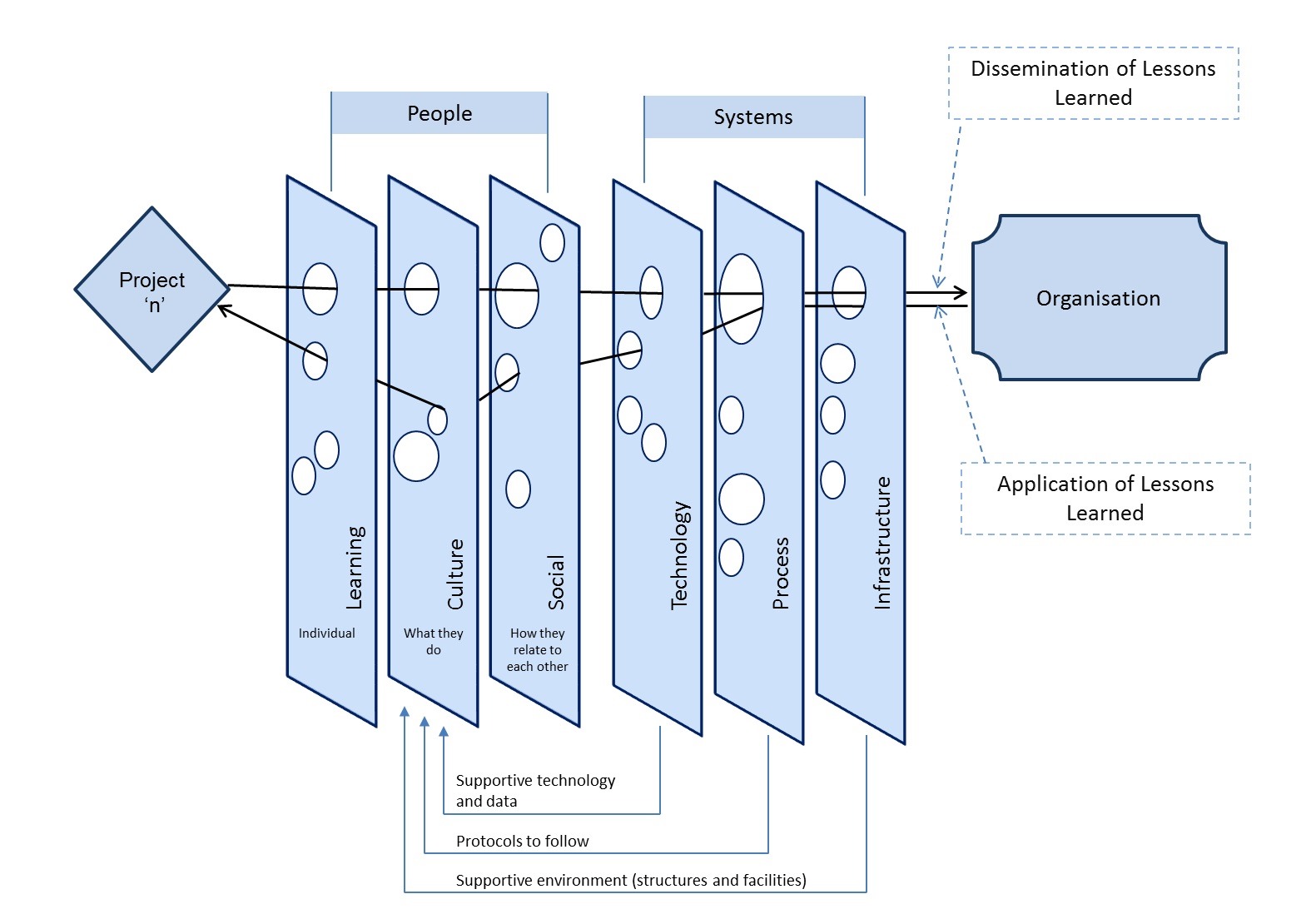
What you are looking at is something called the CALL model, which stands for “Conditions to Actionable Lessons Learnt”. I originally developed the model with Dialogue Mapping and knowledge management in mind – essentially to help my clients do a better job of integrating double loop learning into their projects. However, it soon became apparent that it was valuable in various SharePoint contexts too.
Single vs. double loop learning
In the previous paragraph I made a reference to “double loop learning” without explaining what it was, so let’s quickly make amends because it is interesting stuff. The idea of single and double loop learning has been around for close to 40 years – it was in 1974 when Chris Argyris came up with the idea. To explain, let’s bring back our trusty SharePoint 2010 governance poster that I trash-talked in the first and fourth articles…
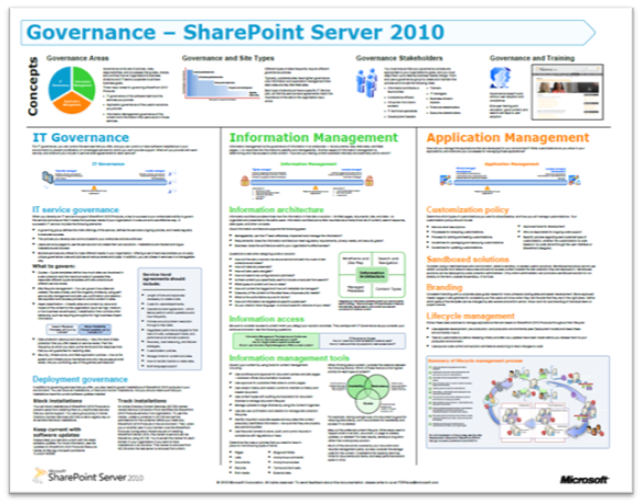
If you have not seen this poster before, it represents what Microsoft believe to be the focus areas for SharePoint 2010 governance. Many people – consultants in particular – will take the information in this poster for granted and create SharePoint governance plans that try to cover off the various areas it suggests to be covered. Everyone will feel good because they have ticked all the boxes of this authoritative fountain of SharePoint wisdom.
Then, if SharePoint then fails to live up to expectations, many will look at the poster and wonder which areas they did not adequately cover. They will study the poster, search Google or Wikipedia for better definitions of the terms listed and then make another reattempt, trying to do an even better job of implementing the wisdom contained therein.
This my friends, is a shining example of single loop learning. Single loop learning, as described in this article “seems to be present when goals, values, frameworks and, to a significant extent, strategies are taken for granted. The emphasis is on techniques and making techniques more efficient.” In single loop learning, the fundamental premise of a course of action remains unchanged. All of the energy of learning is directed to making sure “we get it right this time.” In short, in a single loop learning scenario, repeated attempts are made at solving the same issue, but no-one questions the underlying premise of the strategy.
Now in case you haven’t noticed, I spent the first three posts of this series “questioning the underlying premise” of the above SharePoint governance poster. So in effect I’ve been introducing you to the notion of double loop learning already. Double-loop learning involves taking a deeper look at what is going on. In double-loop learning, having attempted to achieve a goal on different occasions, the goal itself may be modified, re-framed or rejected in the light of the experience gained in trying to achieve it. Think about it – double loop learning actually happened in organisations people would never say things like “well that’s always how we have done it here.”
I see a lot of single loop learning in SharePoint land, and I want to help people break out of their existing framing of the issue – compassionately, of course ![]()
Enter the CALL Model
So getting back to my CALL model, I propose it as a multi-purpose tool that can be used for various SharePoint related stuff. It is based on the Swiss cheese risk management model; a metaphor which suggests most strategies have gaps that create risk. These gaps are analogous to holes in slices of Swiss cheese. In terms of the SharePoint governance poster, think of each of the areas it suggests to be covered as slices of cheese. This key to this model is that it assumes that no single defence layer is sufficient to mitigate risk. It also implies that if risk mitigation strategies are set up with all the holes lined up, there is a systematic flaw, since it would allow a problem to progress all the way through to adversely affect the organisation. Accordingly, the Swiss cheese model encourages a more balanced view of how risk is managed.
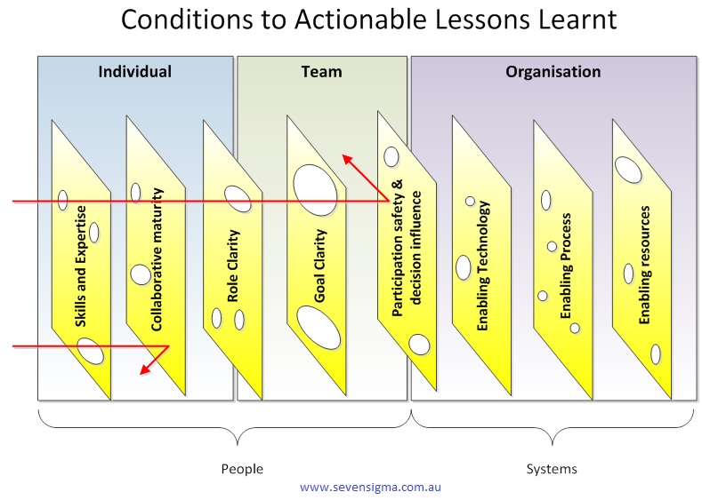
You can think of the CALL model as a SharePoint optimised Swiss cheese model. CALL extends the Swiss cheese model by incorporating cutting edge research in enabling team performance (Hackman), collaboration (Wilder) and knowledge management (Duffield). It outlines 8 actionable areas (Swiss cheese slices) that operate at the individual, team and organisation levels. These focus areas can be thought of as enabling conditions that mitigate risk, as well as focus areas for identification and application of lessons learnt. In other words, my contention is that for SharePoint maturity, you should strive to create these 8 conditions and then consider them when evaluating project performance.

The image above is another drawing of the model minus the pretty colours I used earlier. In this version, I am showing the path of a SharePoint project flows through these 8 areas. Note how the arrow from left to right deviates because we are seeking to use them to mitigate risk via defence in depth. But when it comes to applying learnings from a project (arrow now moves from right to left to close the loop), the flow is designed to be smooth and unencumbered to ensure that the opportunity for double loop learning takes place.
Here is a description of each of the 8 focus areas:
Skills and expertise
This focus area is concerned with ensuring individuals are selected with the right skills and task expertise to perform their role in delivery and operation of services. In SharePoint this is critical because of the technical depth and breadth of the product. Want to deploy SharePoint 2013 request routing in dedicated mode? Go see Spence so he can tell you not to. Want to learn how the new WOPI protocol works with Office Web Apps? Sign a cheque for Wictor to help you.
Skills is closely associated with high IQ. In other words, specialist skills require smart, dedicated people. Therefore this also incorporates ensuring staff have appropriate qualifications and certifications, that education, training and ongoing development practices are properly targeted, and that individuals are willing to learn new skills and be proactive in keeping themselves up-skilled. (In other words, all of the hallmarks of those brilliantly talented people who completed the now defunct Microsoft Certified Masters program).
Collaborative Maturity
Ever heard of the term “dumb smart guy”? Usually it is someone who is intellectually smart, but has all the emotional maturity (EQ) of a potato. Collaborative maturity is all about ensuring that individuals have skills in working collaboratively with others. It signifies a willingness to listen, empathy, mutual respect, understanding and trust. Collaboratively mature people have a tolerance for ambiguity and have the ability to engage in genuine dialogue to reach compromise. Collaboratively mature people also see collaboration in their self-interest and foster develop deep ties with colleagues in order to work interdependently.
Being in the IT industry, I’m not sure if this person actually exists, but hey – this description gives us all something to aspire to!
Role clarity
Role clarity is concerned that the role of each team member is understood by everyone within the team and it is clear how much authority is vested within each role. This in turn provides task clarity, fosters interdependency among a team and reduces process loss. (Process loss is difficulty in knowing who is doing what and how it is done). Where roles are clear and understood, team members are appropriately appointed to tasks according to their capacity (see “skills and expertise” above) and character (see “collaborative maturity” above).
Goal clarity
Goal clarity relates to purpose, direction and goal alignment between members of a team is essential for good team performance. A compelling purpose energizes team members, orients them toward their collective objective, fully engages their talents and motivates them to resolve conflicts. A compelling purpose should be underpinned by concrete, attainable goals and objectives, both short and long term. Knowing where you are heading focuses the team’s energy in directive meaningful activity. This also helps build team efficacy, which is the belief within teams of their ability to solve problems and deliver great solutions. On the other hand, lack of goal clarify is one of the classic symptoms of wicked problems.
Participation safety and decision influence
Ever been on a project that’s taking on water, but nobody seems to be willing to listen? Ever had any critically important topics not discussed because they are simply taboo and unmentionable? It is not fun – and little breakthrough thinking or innovation can exist without participation safety and decision influence. When a team has a high level of participation safety, members feel safe to share ideas, raise unpopular views or opinions, or speak their truth to one another. This reduces groupthink and social loafing, encourages breakthrough and can lead a collaborative team and a collaborative organisational culture. There are countless case studies of major disasters (such as the Deepwater Horizon Oil Spill), where a culture of “only tell me the good news” prevented critical information from being raised that could have averted the issue. In fact ‘communication’ (or lack of it) is probably the most commonly cited project failure factor.
Having said all that, while participation safety is critical, the ideas that team members put forward need to influence the direction and outcome of the team. A manager who says “my door is always open”, but then ignores feedback creates dissonance among team members because what is espoused is not practiced. The simple facts of the matter is that a key element for peak performance is to provide an environment safe enough for team members to speak their truths, to be rewarded for doing so and for truth telling to actually influence direction.
Enabling Technology
Technology underpins all aspects of organisational systems and projects and provides the means to generate leaps in performance and capabilities of users, as more broadly, team and organisational productivity. Technology at its best facilitates the delivery of timely, relevant information for decision making, co-ordination and collaboration. Thus it is critical that technology does not get in the way of delivering value. How often have you worked on a project when you have been forced to use technologies that stifle productivity, create frustration and reduce collaboration between team members? How often has that technology been SharePoint?
Enabling Process
How often have you said to yourself “I can’t believe I have to follow this braindead process.” Process is the glue that provides the rules of behaviour in delivering on goals and like technology, underpins all aspects of organisational systems and projects and is a key part of performance and productivity. It is critical that process, like technology, is always driven by purpose and that it does not get in the way of delivering value. Inappropriate process can make a huge difference in how team members interact with stakeholders and each-other.
Enabling Resources
Enabling resources is concerned with the financial, material and human input necessary to develop and sustain delivery of services. Put simply, even the best teams with the most compelling direction can falter if they are under-resourced. It is critical that sufficient funds, staff, materials and time are provided to get the job done.
Applications for the CALL model
The CALL model can be used in many ways, given its heritage of Hackman, Wilder and Duffield. Examples include:
- A model for performing SharePoint governance health check/assessment
- A model for assessing the makeup of a SharePoint team
- A model for assessing the complexity of a proposed SharePoint solution
- A model for assessing departmental readiness for SharePoint
- A model for developing SharePoint Business Continuity planning
It is worthwhile noting that Hackman developed a team performance instrument called a Team Diagnostic Survey based around his 6 enabling conditions. Since the CALL model is so closely aligned to Hackman, it should also be able to be used in a similar fashion. The same goes for the Wilder research on collaboration, that developed an instrument called the Collaboration Factors Inventory.
So given the source material, the CALL model also has applicability in the areas of:
- An set of enabling conditions to establish to develop high performing teams
- An set of enabling conditions to successful collaborative delivery of projects
- A focus area for the identification of risks (and opportunities) on organisational initiatives
- A framework for the systematic capture of project lessons learnt
- A framework for assessing change and other organisational initiatives
- A governance maturity model
- A knowledge management and organisational learning maturity model
Conclusion
The CALL model reflects a synthesis of three highly rigorous research efforts. All three seemed to gel really well when they were put into the melting pot and I was pleased with the result. In the next post, I will show you how I have used the CALL model when developing a SharePoint Business Continuity Strategy for a client. I’ll also talk about how I have used it in lessons learnt workshops.
Thanks for reading
Paul Culmsee


 )
)