Back to Cleverworkarounds mainpage
 

Confessions of a (post) SharePoint architect: Yellow belt platitude kung-fu

Hi all. It’s been a while I know, but it is time to continue along my journey of confessions of a post SharePoint architect. As I write this, the SharePoint community is in Vegas, soaking up the love of the biggest SharePoint conference yet. For the other twelve SharePoint professionals who are not there, I know your pain.

If this is your first  foray into this series of articles, consider it the closest I will ever get to a SharePoint governance book. Since all new knowledge is gained through the lens of existing knowledge, it is important to note that my world view has been shaped by the increasing amount of non IT work I do in various complex problem solving areas. Essentially this work has had a major effect on the lens that I view SharePoint projects and the approaches I use to steer them. When developing a class on the topic of SharePoint Governance and Information Architecture, I found a fun yet effective way to put coherence around things via Russell Ackoff’s concept of f-laws. These are simple home truths about the way people behave in organisations than explain much more than the complex ones proposed by theorists of various persuasions.

So far in this series we have explored three f-laws, namely:

The next f-law is straight from Ackoff himself and is a universal truth in any project, but absolutely chronic in SharePoint projects as well as many SharePoint slide decks:

F-Law 4: Most  SharePoint governance objectives are platitudes. They say nothing but hide behind words

Most people in the IT industry (with the obvious exclusion of sales guys, Office365 MVP’s and Google employees) tend to inwardly cringe or outrightly roll their eyes when the word “cloud” is uttered during conversation. This is because people instinctively know that what follows is either:

  • Gushing hyperbole squarely aimed at getting you to part with some cash
  • Gushing hyperbole squarely aimed at convincing you that they know what they are talking about
  • Gushing hyperbole in the form of FUD laden counter-arguments from server hugging sysadmins who reject “cloud” outright because they fear irrelevance

These reactions in such conversations result from the term “Cloud” being used in a platitudinal sense. In case you were not aware, a platitude is referred to as “a trite, meaningless, biased, or prosaic statement, often presented as if it were significant and original”. Platitudes are everywhere and usually unavoidable since many people use them unconsciously – especially politicians, senior executives and the aforementioned sales guys. Want proof? Just look on the wall behind the reception area of your office – chances are there is a mission statement there somewhere that would read something like:

“We are dedicated to ensuring a long-term commitment to stakeholder value from performance and improved returns at all levels.”

Does a mission like that sound familiar? What if I told you the line above was generated from a website that generates mission statements like a poker machine. Just pull the lever and within a few seconds, a random assortment of small quotes are mashed together to create a cool sounding sentence. If you enter your company name into it, you can even print a certificate.  I generated this  one for the Heretic’s Guide book. Neat, huh?

clip_image002

The problem, of course, with a platitude is that while it sounds significant, it doesn’t actually tell you much at all. So this f-law states that most SharePoint governance objectives are platitudes. One of the core reasons for this is a side effect of Microsoft’s marketing approach. Consider Microsoft’s SharePoint marketing material as it has evolved. Take a look at how many words survived the transition from Microsoft’s SharePoint pie of 2007, the Frisbee of 2010 and now the square of 2013. Do you see a pattern? What is the average shelf life of a word in each of these diagrams?

image image

Now, let me start out by stating that I have no problems with any of these diagrams. Microsoft is perfectly entitled to develop the message it wants to convey in whatever means it sees fit. The biggest travesty is when people frame the above words as deliverables. They take a superlative word like “improved”, “best practice” or “effective” and then add one of the above words to it. This combination inevitably forms the basis for the justification of putting SharePoint in.

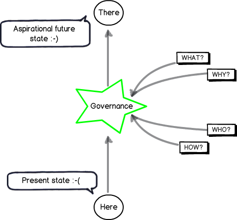
The classic example that still pervades SharePoint projects to this day is the perennial mirage of “Improved Collaboration.” If we return to the “here” and “there” diagrams of the previous posts, it looks like this… note the aspiration goal has a happy smiley on it!

Snapshot

Platitude detection 101

So the first thing you have to do as a SharePoint architect or practitioner is to develop a finely tuned platitude radar. The thing to be aware of is that platitudes come in many forms – some which are obvious and some much more subtle. Thus we will start your platitude radar calibration via a quick and easy method that Ackoff came up with. Years ago, Russel Ackoff critically examined mission statements and said that a mission statement that merely restates the obvious does not say anything that is truly aspirational. To quote from Ackoff:

They often formulate necessities as objectives: For example, ‘to achieve sufficient profit’. This is like a person saying his mission is to breathe sufficiently.

Ackoff’s test to judge the quality of a mission statement was to inverse the statement and see it still made logical sense. If you could not reasonably disagree with this negative version, then the original statement was a platitude. As an example, consider this mission statement from a well-known global organisation:

… our mission and values are to help people and businesses throughout the world realize their full potential.

So, our inverse here is that we are working to hinder people and businesses to realise their full potential. Who in the hell would ever do that? Well – given this is Microsoft’s mission statement, suddenly Windows Vista is finally starting to make sense to me. Smile

Now, go and take any word from the 3 diagrams above and put a superlative like “biggest”, “best”, “optimum” or “improved” in front. If I use my example – “Improved Collaboration” – Ackoff’s inversion approach results in “Worse Collaboration” and is therefore a platitude. I mean – aside from the odd command and control boss, would anybody seriously want to make collaboration less effective?

So, to put it simply – stop stating the bloody obvious! If your SharePoint goal doesn’t satisfy Ackoff’s simple platitude test, you have a problem.

The seeds of doom are sown at the start…

Now that I have wired up your platitude detector via Ackoff’s inversion test, you will start to notice how utterly pervasive they are in SharePoint projects and beyond. As Kailash and I state in the Heretics Guide book:

A platitude is a mental shortcut we take, a deceptively quick way to cut through uncertainty. We clump our unclear, unarticulated aspirations in a bunch of platitudes. It is easy to do and it gives us a sense of achievement. But it is a mirage because the objective is not clear and we cannot define sensible measurements of success if the goal is fuzzy. It never fails to amaze us that many organisational endeavours are given the go-ahead on the basis of platitudinous goals. Mind-boggling, isn’t it?

What is really amazing and sad at the same time is how badly the platitude problem is misattributed. One of my students at a recent SPGovIA class said that with SharePoint projects “the seeds of doom are sown at the very beginning”. He’s right too…project teams will commit significant time and money into a project that is chasing a platitude, and when things inevitably go haywire, will blame the process, methodology, people… everything but the mirage at the root of it all.

The seduction of a platitude is strong. Many have been entranced by some nice sounding desirable future state incorporating some superlative like “Improved quality” or “Best practice collaboration”. But the key point is this: The platitude becomes a sort of proxy for the end in mind rather than the real end. We have no shared understanding of what where we want to get to. Empty words preclude a shared understanding because they mean nothing at all.

The image below illustrates the effect of a platitude being confused with the actual desired state. We do not have an aspirational future state at all. Instead, we have many possible, fuzzily-defined future states.

Snapshot

If you look really closely, the future state is a sad smiley. This is because the visible symptoms of a project with a divergent understanding among participants are well documented. Scope creep and vague requirements mean that the project will start to unravel, yet the platitude-driven journey towards the mirage will continue. The project will lurch from crisis to crisis, with scope blowing out, tensions and frustrations rising. This is accompanied by classic blame-shift or hind-covering moves that people make when they realise that their ship’s taking water.

How to defeat a platitude…

I am going to conclude this post at this point because it is starting to get too long. But I will leave you with a teaser about the next post…

One of the most important things about dealing with a platitude is knowing what *not* to do. I know that what I am about to say may sound counter intuitive to many readers, but trust me when I tell you that there are two things you should avoid doing.

  1. Never, never, never ask someone what they mean when they use a platitude
  2. Never try and come up with a definition for a platitude

In the next post, I will elaborate on these two contentions and provide you with a much better way to get past the seductive danger of platitudes, so you can find out what really matters to your stakeholders.

Until then, thanks for reading…


Paul Culmsee

www.sevensigma.com.au

Falling Books Stack


Confessions of a (post) SharePoint Architect: The self-fulfilling governance prophecy

Hi and welcome to another SharePoint (post) architect confessional post. In case you are here via the good grace of whatever Google’s search relevance algorithm feels like doing today, I need to give you a little context to this post and the larger series of which it is a part. These days, I spend a lot of time working on projects beyond the cloistered confines of SharePoint; in fact, beyond the confines of IT altogether. Apart from being a cathartic release from SharePoint work, I’ve had the privilege to work with various groups on solving some very complex problems in a collaborative fashion. As a result of these case studies, I’ve become a bit of a student of various collaborative problem solving approaches and recently released a business book on the subject called “The Heretics Guide to Best Practices” co-written with mild-mannered mega-genius Kailash Awati. Despite (or because of) the book having no absolutely SharePoint content whatsoever, it managed to win an Axiom Business Book award and I feel it’s indirectly a good SharePoint governance book in its own right.

Now, for the rest of you who have been following my epic rant thus far, you will now be familiar with the notion of Ackoff’s f-laws: “truths about organisations that we might wish to deny or ignore – simple and more reliable guides to everyday behaviour than the complex truths proposed by scientists, economists, sociologists, politicians and philosophers.” Via the f-law metaphor, you now also understand why midwives are more valuable than doctors, the word “governance” should not be defined if you actually want people to understand it and that people should not be penalised for their learning.

The next f-law that we will explore provides an explanation to why organisations so consistently and persistently apply the wrong approaches to SharePoint-type projects. IT departments have genetic predisposition to falling into this trap, as do other service delivery departments such as Finance and HR when they put in ERP systems. To explain my assertion, we are going to revisit the governance diagram that I used in the first f-law. You can see it below:

I used the above diagram to to explain f-law 1 which was “The more comprehensive the definition of governance is, the less it will be understood by all”. The above diagram serves to point out that governance is not the end in mind, but the means by which you achieve a desirable future state. Without any context to an end in mind, we have to accommodate many vague potential ends. To deal with this uncertainty, we inevitably look to definitions to provide clarity about what governance means. Unfortunately, this form of “definitionisation” tends to confuse more than clarify because it sneakily starts to drive the end, rather than be the means. This inevitably results in over-engineered, over-complicated and likely inappropriate governance approaches that do more harm than good.

It should be noted that “governance” is by no means the only word that falls into this trap. Words like quality, effective, “best practice” and even “SharePoint” should all be put in the green star above too because all of these words have no inherent meaning until they are applied to a given situation or context. This point is echoed by people like Andrew (“SharePoint by itself knows nothing”) Woodward, Dux (“SharePoint doesn’t suck – you suck.”) Sy and Ruven (“Can I use this diagram in my Information Architecture book?”) Gotz.

To that end, our next  f-law expands on this notion of means vs. ends and provides you with a practical way to assess the clarity of a SharePoint goal or outcome.

F-Law 3: The probability of SharePoint success is inversely proportional to the time taken to come up with a measurable KPI

Hmm… f-law 3 is a mouthful isn’t it. For a start I used the acronym of “KPI”, which in case you are not aware, stands for Key Performance Indicator – something that we can measure to visibly demonstrate that we have not sucked and actually achieved what we have set out to do. In essence, this f-law states that the longer it takes to determine a reasonable and measurable indicator that SharePoint has been a success, the less likely your SharePoint project is to succeed.

To demonstrate this, I am going to give you one of my patent pending techniques that is highly useful in client engagements to get people to think a little differently about their approach. Let’s reuse my “from here to there” diagram above to perform a basic experiment. Check out the project below and tell me … what project is this?

image

Hopefully, it did not take you long to work out that this project is the Apollo moon missions. Now, for the experimental bit. Grab a stopwatch, start the clock and answer this question:

“How do you know you have succeeded with this project?”

Once you have your answer, stop the clock and note the time. I’m willing to bet that you gave one or two answers:

  • You successfully landed a person on the moon
  • You got the person back to Earth again

I am also willing to bet that you worked out that answer within 2 to 15 seconds of pondering my diagram. Am I right?

Now, consider for a moment the sheer scale of of this project in terms of size, risk, innovation and level of expertise required to land a person on the moon and bring them back safely. Imagine the sheer number of projects within multiple programs of work that had to be aligned. Imagine the tens of thousands of people who directly and indirectly worked on this epic project. It is mind boggling when you think about it and it is little wonder that putting a man on the moon is regarded one of mankind’s greatest technical achievements.

And then we have SharePoint…

Now let’s contrast the moon project with another one likely to be very familiar with readers. So once again, tell me what project this is…

image

This one takes some people a bit longer to answer, but when I ask this in workshops and conferences I sometimes get people jokingly saying “my SharePoint project!” or “a nightmare.” So once again I want you to answer the following question:

“How do you know you have succeeded with this project?”

I bet this one has you a little more stumped and is much harder to answer than the moon example above. What is funny with this one is that, when you consider that in terms of scope and size, using SharePoint to improve collaboration is a mere pimple on the butt of sending a rocket to the moon. Yet, despite the moon example being much larger in scope, cost, degree of innovation and engineering, the success criteria is clear and unambiguous to all. People can identify what success looks like very quickly. No-one will point to Venus and say “I think that’s the moon.”  You either got there or you didn’t.

Yet, when I show a SharePoint project that is framed like the above example, people have a much (much) harder time describing what success would look like. In fact, I have asked this question many times around the world and most of the answers I am offered do not hold up to any serious form of scrutiny. Consider these common suggestions of SharePoint success and my response to them:

  • “People are using it.” My response: “Yeah, but people use email and the file system now, so why are you putting SharePoint in?”
  • “People are happy.” My response: “I bet if I replaced the crappy coffee with a top of the range espresso machine I could make people really happy and it’s a fraction of the cost of SharePoint.”

Sorry folks, but this isn’t good enough… in fact it’s a recipe for a situation where, in the name of “governance,” you deliver a bloated, over-engineered failure.

When problems are complicated…

My two project examples above highlight a particular characteristic of problems that is at the root of the difference between the moon and SharePoint example. Consider the following common IT projects:

  • Replacing your old email system with Microsoft Exchange
  • Consolidating Active Directory
  • Replacing your old phone system with Voice over IP system
  • Upgrading your storage area network  to new infrastructure

All of these are like the moon example. None of them are easy – in fact you need specialist expertise to get them successfully implemented. But when you put each of these in the green star of my “here to there” picture, criteria for success is fairly clear and unambiguous. For example, if email comes in and goes out of everyone’s inboxes, Exchange is a usually success. If you can pick up the phone, get a dial tone and make a call, then the VOIP upgrade has been a success.

These are all examples of complicated problems. With complicated problems, the criteria for success is clear and unambiguous and there is a strong relationship between cause and effect. You can be highly confident that doing X will lead to Y. In these sorts of problems, experts can come together and analyse the problem by breaking the problem down neatly into its parts to develop a high-confidence solution. Furthermore, there are likely to be many best practices that have emerged from years of collective wisdom of implementing solutions because of that relationship between cause and effect.

Wouldn’t it be nice if reality was always like this. Project Managers and tech people would actually get on with each other! But of course, reality paints a different picture…

When complicated approaches fail…

In a 2002 discussion paper about reform of the Canadian health system, authors Sholom Glouberman and Brenda Zimmerman make a statement that is completely applicable to how most organisations approach SharePoint:

In simple problems like cooking by following a recipe, the recipe is essential. It is often tested to assure easy replication without the need for any particular expertise. Recipes produce standardized products and the best recipes give good results every time. Complicated problems, like sending a rocket to the moon, are different. Formulae or recipes are critical and necessary to resolve them but are often not sufficient. High levels of expertise in a variety of fields are necessary for success. Sending one rocket increases assurance that the next mission will be a success. In some critical ways, rockets are similar to each other and because of this there can be a relatively high degree of certainty of outcome. Raising a child, on the other hand, is a complex problem. Here, formulae have a much more limited application. Raising one child provides experience but no assurance of success with the next. Although expertise can contribute to the process in valuable ways, it provides neither necessary nor sufficient conditions to assure success. []

In this paper we argue that health care systems are complex, and that repairing them is a complex problem. Most attempts to intervene [] treat them as if they were merely complicated. [] We argue that many of these dilemmas can be dissolved if the system is viewed as complex.

The key point in the above quote is that the tools and approaches that work well with complicated problems actually cause a lot of trouble in complex problems, where certainty of an outcome is much less clear. My point is that while the notion of using SharePoint to get from “poor collaboration” to “improved collaboration” might seem logical on the surface, it is hard to come up with any sensible criteria for success. Therefore you are setting yourself up for a fail because you have made SharePoint take on the characteristics of complex problems. Without unpacking these implicit assumptions about “Improved Collaboration,” our aspirational future state will look like the diagram below. The reality is we have many aspirational future states, all hidden beneath the seductive veneer of “improved collaboration” that in reality tells us nothing.

image

What blows me away is that to this day most project governance material published consistently fail to realise this core issue while trying to treat the very symptoms caused by this issue!  They provide you with the tools, means and methods to chase goals which are little better than an illusion, with no means to measure progress and therefore guide the very decisions that are made in name of governance.

Without unpacking and aligning all of these different future states above, how can any SharePoint architect be sure that they are providing the right SharePoint-based enabler? If you cannot tell me the difference made by implementing a project, how can anyone else know the difference? Even if you can, how do you know that everybody else sees it the same way as you?

Is it little wonder then, that after more than a decade of trying, SharePoint projects (complex problems) continue to go haywire? While approaches to governance force a complicated lens on a complex problem and assume the goal as stated is understood by all, governance itself will be one of the root causes of poor outcomes. Why? Because governance will require people to focus in all the areas except the one that matters. When this gap in focus manifests visibly (for example SharePoint site sprawl), governance is seen as the means to address the gap. Thus governance becomes a self-fulfilling prophecy “We will get it right this time” is the mantra, all the while, we still chase those rainbows of “improved collaboration.”

Conclusion and coming next

I do not recall where I first heard the distinction between “Complicated” and “Complex” problems because I came across it some time after I discovered the term “wicked problem.” I suspect that it was the Cynefin model that first pushed my cognitive buttons on the idea, although I distinctly recall Russell Ackoff also making the distinction between complex and complicated. Irrespective of the source, I find this a hugely valuable frame of reference to examine problems and understand why SharePoint projects are routinely tackled in an inappropriate manner. With it, I have been able to give IT departments in particular, a frame of reference to understand why they have trouble with particular kinds of projects like SharePoint.

Many people in organisations do not discern the difference between a complicated and complex problem and use the tools of the “complicated problem toolkit” to address complex problems when they are inappropriate at best and will kill your project at worst. I will expand on why this happens in the next and subsequent posts. But my key takeaway is that addressing the issue of multiple interpretations of the future is not only the key SharePoint governance challenge, it is the key challenge for any complex project.

The sorts of tools and approaches that are part of the “complex problem” utility belt are numerous and are really starting to gain traction which is great. There is plenty to read on this topic elsewhere on this blog as well as people like Andrew Woodward and Ruven Gotz. The great irony is that if you do manage align people to a shared sense of what the end in mind will look like, things that might have been seen as complex will now become complicated and the traditional tools and approaches will have efficacy because outcomes are clear and the path to get there makes more sense.

In the next post and f-law, I am going to outline another chronic issue that further explains why we get suckered into chasing false goals…


Thanks for reading

Paul Culmsee

www.sevensigma.com.au

HGBP_Cover-236x300


Save the date in October: SharePoint Governance and Dialogue Mapping in the UK

Hi all

Just to let you know that in October, I will be in the UK to run a SharePoint Governance and Information Architecture class with Andrew Woodward. Additionally, I am very pleased to offer a Dialogue Mapping introductory course for the first time in the UK as well. Work has been extremely busy this year and this is my only UK/Europe trip in the next 9-12 months. In short, this is likely to be a once-off opportunity as I travel less and less these days.

Introductory Dialogue Mapping October 17-18, 2012

  • Venue: The Custard Factory, Birmingham, UK
  • Cost: £995

Eventbrite - UK: Solving Complex Problems with Issue Mapping

The introductory Dialogue mapping class will arm you with a life skill that can be used in many different situations and has changed my career. If you have been following my “confessions of a (post) SharePoint Architect” series, a lot of the content is based on my experiences of Dialogue Mapping many different projects in many different industries. Dialogue Mapping is a novel, powerful and inclusive method to elicit requirements, capture knowledge and develop shared understanding in complex projects, such as SharePoint or broader strategic planning. It was pioneered by CogNexus Institue in California, and is used by NASA, the World Bank and United Nations.

My book, “The Heretics Guide to Best Practices” is based on my Dialogue Mapping work and if you liked the book, then I know you will love the course!

What does a map look like? Check out my map of the AA1000 Stakeholder Engagement Standard or my synthesis on problems with intranet search below…

image  image

I should stress that this is not a SharePoint course. If you are an organisational development practitioner, facilitator, reformed project manager, all-round agitator or are simply interested in helping groups make sense of complex situations, then you would find this class to be highly valuable in your personal arsenal of tools and techniques. When performed live during a facilitated session, it is a highly efficient and engaging experience for participants.

Please note that seats are limited in this class and it cannot be more than  10.

  • Date: October 17-18, 2012
  • Venue: The Custard Factory, Birmingham, UK
  • Cost: £995

Eventbrite - UK: Solving Complex Problems with Issue Mapping


Aligning SharePoint Governance & Information Architecture to Business Goals October 15-16 2012

  • Venue: The Custard Factory, Birmingham, UK
  • Cost: £995
  • Limited seats available: 12

Eventbrite - #SPGov+IA Aligning SharePoint Governance & Information Architecture to Business Goals with Paul Culmsee

Previous Master Class Feedback:

  • "This course has been the most insightful two days of my SharePoint career"
  • "…Was the best targetted and jargon free course I’ve ever been on"
  • "Re-doing my draft SharePoint Governance. Moving away from blah, blah technical stuff"
  • "Easily one of the best courses I’ve been to and has left me wanting more!"
  • "Had a great couple of days at #SPIAUK loving IBIS"
  • "The content covered was about the things technically focussed peeps miss.."

Most people understand that deploying SharePoint is much more than getting it installed. Despite this, current SharePoint governance documentation abounds in service delivery aspects. However, just because your system is rock solid, stable, well documented and governed through good process, there is absolutely no guarantee of success. Similarly, if Information Architecture for SharePoint was as easy as putting together lists, libraries and metadata the right way, then why doesn’t Microsoft publish the obvious best practices?

In fact, the secret to a successful SharePoint project is an area that the governance documentation barely touches.

This master class pinpoints the critical success factors for SharePoint governance and Information Architecture and rectifies this blind spot. Based upon content provided by Paul Culmsee (Seven Sigma) which takes an ironic and subversive take on how SharePoint governance really works within organisations, while presenting a model and the tools necessary to get it right.

Drawing on inspiration from many diverse sources, disciplines and case studies, Paul Culmsee has distilled in this Master Class the “what” and “how” of governance down to a simple and accessible, yet rigorous and comprehensive set of tools and methods, that organisations large and small can utilise to achieve the level of commitment required to see SharePoint become successful.

Seven Sigma, together with 21apps, are bringing the the acclaimed SharePoint Governance and Information Architecture Master class back to the UK, October 2012.

  • Date: October 15-16, 2012
  • Venue: The Custard Factory, Birmingham, UK
  • Cost: £995
  • Limited seats available: 12

Eventbrite - #SPGov+IA Aligning SharePoint Governance & Information Architecture to Business Goals with Paul Culmsee


Thanks for reading

Paul Culmsee


Confessions of a (post) SharePoint architect: Do not penalise people for learning

Hi all and welcome to another small piece of my SharePoint architect manifesto. In the previous post I introduced you to the notion of f-laws, which were first coined in a book co-authored by Russell Ackoff. In the process of developing a SharePoint governance and information architecture class, I was inspired to use the idea of an f-law because they appealed to my contrarian sense of humour and also contained some interesting nuggets of wisdom. I ended up coming up with a heap of f-Laws for SharePoint, and plan to write an article to cover each one.

In the last post, we learnt that f-Law 1 was all about the contention that the more you try and define what governance is, the less anyone will actually understand it. If you never read the first SharePoint Governance f-law then I suggest you do so, because these articles do tend to build on the foundation set from the previous. On that note, the focus of todays f-law extends on one that Ackoff himself came up with. All I am doing it putting a SharePoint bent on it…

F-Law 2: There is no point in asking users, who don’t know what they want, to say what they want.

This f-law comes with an additional corollary: There is even less point in thinking that you already know what they want! (IT departments – I am looking at you here!)

The definitive way to explain this f-law is to leverage the work of one of my mentors – Jeff Conklin. In 2007 I read a paper of his that literally changed my career. It was titled “Wicked problems and social complexity” and despite me reading many papers since, to this day it is one of the best introductions to complex problem solving you could ever read.

In this paper, Jeff talks about the fact that many prevailing methodologies suggest that the best way to work on a problem is to follow an orderly and linear “top-down” process, working from the problem to the solution. You begin by understanding the problem, including gathering and analysing “requirements” from customers or users. Once you have the problem specified and the requirements analysed, you are ready to formulate a solution and eventually implement that solution. This is illustrated by the red line in the figure below.

image

Now many project managers, cheque signers and just about every program management office I have ever worked with try to operate this way because it promises order, certainty and control. This is understandable when ones performance is being judged on getting stuff done to an agreed time and cost. It is also understandable if you are a manager and will get your ass kicked if you blow your budget. There is only one teeny issue. For some scenarios, it simply does not work.

In Conklin’s paper, he detailed a 1980’s case study at the Microelectronics and Computer Technology Corporation (MCC) that looked into how people solve problems. A number of designers participated in an experiment where they were give a one page problem statement – not too different to many SharePoint business cases I have seen. Participants in the experiment had to design an elevator control system for an office building. Despite participants being experienced and expert integrated-circuit designers, none had ever worked on elevator systems before. Each participant was asked to think out loud while they worked on the problem. The sessions were videotaped and analysed in detail.

Below is what really happened. Check out the green line…

image

Clearly, the subjects in the elevator experiment did not follow a linear approach. They would start by trying to understand the problem, but they would immediately jump into formulating potential solutions. Then they would jump back up to refining their understanding of the problem. Rather than being orderly and staged like the red line, the line plotting the course of their thinking looked more like a seismograph for an earthquake. Now if you are looking at the green line and thinking “my god I better put a stop to that sort of shenanigans,” consider what Conklin had to say about it in his paper:

These designers are not being irrational. They are not poorly trained or inexperienced. Their thought process was something like: “Let’s see, idle elevators should return to the first floor, but then, you only need one elevator on the first floor, so the others could move to an even distribution among the floors. But the elevators need to be vacuumed regularly. I suppose we could add a switch that brought idle elevators down to the first floor. But then what happens in an emergency?” In other words, what is driving the flow of thought is some marvellous internal drive to make the most headway possible, regardless of where the headway happens, by making opportunity-driven leaps in the focus of attention. It is precisely because these expert designers are being creative and because they are learning rapidly that the trace of their thinking pattern is full of unpredictable leaps.

When I am speaking at conferences I like to mess with project managers in particular (who doesn’t eh?), because they are an easy target and already an insecure lot to begin with. I will ask the audience if anybody has an industry certification, such as a PMP or Prince II. Several hands usually go up. I then point to the phases of the above diagram and ask them if – when they were studying hard to obtain their certification – they actually followed the discrete phases that everybody else is supposed to follow. No single person has ever suggested that they did, instead all acknowledging that their process of learning looked more like the green line. I then point out that I’ve always found this perversely funny that people follow the green line to learn a process that tries to insist that everybody else must follow the red line. Ironic huh?

Knowing vs. learning problems

It should be stated at this point that you can use the red-line approach for certain types of problems so I am not outright dismissing it. In fact, within SharePoint projects there are indeed elements that can work quite well this way. The green line on the other hand, represents a phenomenon that Conklin called “Opportunity driven problem solving” and is the de-facto way we work on problems that are new or novel. For example, if you have ever experienced an “aha” moment, it was probably a leap of cognition that followed the jagged green line up or down, where you suddenly saw the problem in a different light. (Shhhh… don’t let your project manager know because you will have to fill in a form of some description!)

In these types of problems, we do not start by gathering and analysing data about the problem because the problem itself is moving target and varies depending on different stakeholders and their world views. Thus, there is no pure and concrete understanding of “the problem” because it is still forming as you think about solutions. In short, the jagged green line is a picture of learning. Quoting again from Conklin:

The more novel the problem, the more the problem solving process involves learning about the problem domain. In this sense the waterfall is a picture of already knowing – you already know about the problem and its domain, you know about the right process and tools to solve it, and you know what a solution will look like. As much as we might wish it were otherwise, most projects in the knowledge economy operate much more in the realm of learning than already knowing. You still have experts, but it’s no longer possible for them to guide the project down the linear waterfall process. In the current business environment, problem solving and learning are tightly intertwined, and the flow of this learning process is opportunity-driven

I believe that many innovations stem from the opportunity driven, creative leap of faith of the green line. On that note, I’d say that one of the greatest opportunity driven learners had to be Einstein. An article by Mort Orman suggests that Einstein was intrigued by “holes” in prevailing theories and enjoyed posing “mind riddles” to himself, just to see if present theories could satisfactorily explain them. Unlike many others who might have given up when they got stuck, Einstein was persistent and kept at it for 10 years before he came up that little formula everyone knows. After explaining this story at conferences, I sometimes ask people “Do you think Einstein used waterfall when he came up with relativity?” No one has said yes yet…

image

Implications…

The pattern of behaviour between the red and green lines represents the difference between a knowing problem and a learning problem. With a knowing problem, the problem is clear to all participants and even though it might require specialist expertise to solve, many of the variables are well understood. But for a problem that is novel or requires learning from participants Conklin’s case study illustrates that:

  1. People will examine potential solutions just to explain the problem.
  2. Each instance of examining the solution will impact the understanding of the problem.

Given that SharePoint is almost always starts out as a learning problem for the majority of participants, I do not see the point in trying to fight that green line. Instead, it is critical that you work with it rather than against it. The difficulty people have with this is that to do so conflicts with that promise of certainty, order and control that the red appears to offer. Why? Well among other things, you have to:

  1. Expect fluid requirements and scope changes
  2. Involve stakeholders from the start (they have to live with the result and their up-take is presumably a key KPI)
  3. Expect resistance and pullback from stakeholders (because people attribute more to what they perceive to lose compared to what they might gain)

Above all, you have to avoid penalising people for their learning. If you put barriers in front of people who are trying to improve their understanding of a multi-faceted problem they will eventually disengage from you. If you want to guarantee this sort of disengagement, go right on ahead and solve some problem before your stakeholders even realise there is a problem. Then when they do realise, smack them with the metaphorical baseball bat known as the scope variation form. One of two of those babies and those annoying stakeholders are guaranteed to go away. A pity your solution will go away with them but hey, it was in scope right?

Confessions…

I deal with this core issue of not penalising learning in a number of ways… some of which I have outlined in blog posts and many that I will cover in detail as we progress in this series and examine more f-laws. If you simply can’t wait for me and want “the answer” then I have news for you. If it were that easy there would be a “best practice” for it and someone would have created a certification by now!

So instead I will give you a couple of KPI’s to work to.

  • KPI 1: You get to a stage where your clients questions are “informed”. It is pretty easy to tell as a SharePoint professional where your stakeholders are at in their understanding of SharePoint. Over time there is a certain level of maturity in the questions asked of you and the way they are asked. This reflects both stakeholder learning as well as your ability to teach. If you get to this stage, you have increased your chances of SharePoint success significantly, which leads onto the next KPI…
  • KPI 2: You get to the stage where your clients are asking you well informed questions that you don’t know the answer to. Trust me that they will not mind that you don’t because their awareness of the product will no longer be naively simplistic anyways. You will also have developed a great collaborative partnership by then too. Also don’t forget my quote from Horst Rittel in the midwives post. There is a symmetry of ignorance with complex problems. The knowledge required to solve a complex problem never resides with a single person.

This leads me onto the final KPI:

  • KPI 3: Your clients should start telling you stuff about SharePoint that they have done that you have never done before or didn’t know you could do. In short, they will start teaching you stuff.

If you can create those conditions, be happy that they don’t need you that much anymore.


Thanks for reading


Paul Culmsee

www.hereticsguidebooks.com

www.sevensigma.com.au


Confessions of a (post) SharePoint Architect: Don’t define “governance”

Hi all and welcome to the second post of a series that I have been wanting to write for a while. In this series, I am going to cover some of the lesser considered areas of being a SharePoint architect and by association, key aspects to SharePoint governance. In the first confessional post I alluded to the fact that a good SharePoint architect also need to architect the right conditions for SharePoint success. As I work through this series of articles, I will elaborate further on what those conditions are and how to go about creating them.

To do this, I am drawing from my non IT work as a Dialogue Mapper and facilitator, and where applicable, will cover these case studies to see if they give us any insights for SharePoint. I also hope to dispel some common myths and misconceptions about SharePoint project delivery in organisations. Some of these might challenge some notions you hold dear. But for the most part, I hope that many of you reading this find this material to be instinctively compatible with what you have already come to believe. If you are in the latter group and feel as if you are an organisational agitator, this just might give you that rigour and ammo that you need when getting through to the powers that be. Better still, tell them to read this series and let them decide for themselves.

Backstory: Ackoff and f-Laws

image

For what it’s worth, a fair chunk of this material comes from my book, as well as the first module of my SharePoint Governance and Information Architecture class that I run a few times a year in various places around the world. When I designed that class, I was inspired by Russell Ackoff, who co-wrote a funny and highly readable book called “Management f-LAWS: How organisations really work”. F-Laws were defined as:

“truths about organisations that we might wish to deny or ignore – simple and more reliable guides to everyday behaviour than the complex truths proposed by scientists, economists, sociologists, politicians and philosophers”

In case you hadn’t noticed, if you remove the hyphen, each f-law become a flaw. You could also consider them as #fail laws. Years ago, I laughed and at the same time, inwardly cringed when I read each f-Law that Ackoff and his co-authors had come up with. I came to realise that SharePoint problems are simply a microcosm of broader issues that plague organisations. If you read Ackoff’s book (and I highly recommend it), you will soon realise that the word “Management” could easily be substituted with “SharePoint” and it doesn’t take much to come up with a few of your own f-laws. This is exactly what I did and at last count, I have 17 of them. In this post, I will detail the very first one.

F-Law 1: The more comprehensive the definition of governance is, the less it will be understood by all

The first condition that I need to design as a SharePoint architect is to put to bed the many misconceptions about SharePoint governance. In this f-Law, I state that the more you try and define what SharePoint governance is, the less anybody will actually understand it. If you consider this counter-intuitive, then let me take it even further. For any project that has a change management aspect (SharePoint projects often are), definitonising not only doesn’t work, but it is actually quite dangerous to your projects health.

To explain why I have come to this conclusion, I’d like to tell you a little story from my non IT work. Several years ago, I was working in a sensemaking capacity with an organisation to help them come up with a strategic plan and performance framework for a new city. This was not a trivial undertaking. The aim was to create a framework with an aligned set of KPI’s to realise the vision for what the city needed to be in the year 2030. While the vision for the city had been previously agreed and understood, the path to realise that vision had not been.

Now if you have ever been involved in strategic plan development, and think that working out your corporate strategy is difficult, I have news for you. Aligning an organisation to a 3 year plan is one thing. Working with a diverse group to determine performance measures of a future city 25 years away is a different thing altogether. I never realised at the time we did this work, just how unique and (dare I say) “cutting edge” it was. Participants were highly varied in skills and areas of interest, and to say each had their own world-view was an… understatement to say the least.

I my book I describe this case study in detail but for the sake of post size, let’s just say that the opportunity to do this work arose from a failed first attempt to create the framework. The first time around an excel spreadsheet was projected onto the wall that looked like the example below. Attempts were made in vain to fill in the strategic outcomes, strategic objectives, key result areas, key performance indicators and measures. After a frustrating few hours of trying this approach, we gave up because participants spent all of their time arguing over the labels and got bogged down in a tangle of definitions and ambiguous terminology. Was it a KPI (Key Performance Indicator) or a KRA (Key Result Area)? Was it a Guiding Principle or a Strategic Objective? Was it a KRA or a Critical Success Factor?  Attempts to resolve this issue with definitions got nowhere because even the definitions could not be agreed upon.

image

In the end, we solved this issue via a rather novel use of Dialogue Mapping along with a problem structuring approach outlined in a book called Breakthrough Thinking. If you’d like to know more on how it was done, then take a look in chapter 12 of the Heretics Guide.

The criticality of context…

The core problem boiled down to context – or lack of it. What I learnt from this is that in situations without a shared context (and the wrong tools to deal with it), we fall back to using definitions to try and fill the gap. When faced with a blank spreadsheet and just some labels, participants attention was fixated on the definitions of the labels, rather than the empty cells where the focus needed to be. This resulted in a bunch of long winded discussions about what terms meant. This seriously stymied efforts aimed at making progress.

I have since performed many workshops, both SharePoint and non SharePoint ones and the pattern is clear. In fact I contend that if you proceed down the road of trying to build context via definitions for complex problems, one of three things will happen.

  1. The definition becomes more verbose. There are a couple of reasons for this:
    • – The definition is expanded to incorporate new aspects of the topic space. In an organisational setting, this creates confusion because the definitions of multiple disciplines can often seemingly contradict each other and thus, careful “wordsmithing” is required to navigate a path through it.
    • – New qualifications or exceptional situations have to be excluded. This leads to more new terms being used in the definition.
  2. As a result of #1, a broader, fundamental definition is developed. This broader definition encompasses more and so is prone to motherly sounding platitudes. Further, such definitions also run the risk of being interpreted in ways other than the one intended by those who worked so hard on the definition.
  3. As a result of #1 and #2, a new word is used or an existing word is used in a new context to try and convey the new meanings or concepts proposed. I have heard governance described as “stewardship”, “risk management” and (guilty as charged), “assurance”.

The effect of this can be far reaching in a bad way because definitionising has a habit of blinding people to what really matters. This leads to terrible project decisions being made up front that have serious consequences. To understand why, consider the image below:

Snapshot

This image represents how governance of a SharePoint project should be viewed. A SharePoint initiative takes time and effort which costs money. We presumably have recognised that the present state is lacking in some way and want to get to somewhere better – an aspirational future place (if you look closely in the left above image note the happy and sad smilies). Accordingly we accept the cost of deploying SharePoint because we believe it will make a positive difference by doing so. If this was not the case, you would be wasting your time and resources on a pointless initiative. Therefore, it is the difference made by the initiative that will tell you if you have succeeded or not. As a result, we have to have a shared context on what that aspirational future looks like!

Don’t confuse the means with the ends…

Governance is, therefore, the means by which you will achieve the end of getting to some better place. It is informed by the end in mind and this is why I drew it in the star in the middle of the above diagram. For example; If the end in mind was compliance, then I will govern SharePoint a heck of a lot differently than say, if the end in mind was improving collaborative decision making.

But consider the diagram below. In this context, it should be clear why working from a definition of governance is often problematic. It implies that:

  1. Governance is not being informed by the end in mind;
  2. Your team do not have a shared understanding of what the end in mind actually looks like.

When this happens, project teams rarely realize it and respond by substituting the end with the means. We overly focus on governance via definition without any clarity or context as to what the aspirational future state actually is. Like the example of the blank spreadsheet example I started with, reality starts to look more like the diagram below: (note the happy smilie is gone now)

Snapshot

Steering…

So how do we steer out of this definition pickle? Interestingly “steer” is a appropriate choice of word if we look at the origin of the word “Govern”. This is because “Govern” is a nautical term from Latin and actually means “to steer”. So if your SharePoint project has been more like the Titanic, and hit a giant iceberg along the way, then clearly you need to focus your governance efforts to looking at what is in front of you, rather than scrubbing the deck or keeping the engine room well oiled. The latter tasks are important of course, but you can do all that, still hit an iceberg and waste a lot of money.

To steer, we all have to understand what the destination is, or at the very least, all agree on the direction. To help you with that journey, consider my final diagram. To steer SharePoint the right way for your organisation requires you to answer four key questions:

  1. What is the aspirational future state and what does it look like?
  2. Why is this the aspirational future state we want?
  3. Who will do what to get us to that state?
  4. How will we get to that state?

Snapshot

The fundamental problem with most SharePoint projects is that questions 1 and 2 are not answered sufficiently, if at all. The next few posts will explore why this is the case, but in the meantime, remember that we could do a SharePoint project that is to scope, time and cost, yet still have no user up-take if we are solving the wrong problem in the first place. Therefore remember that:

  1. Governance is a means to an end, and not the end in itself.
  2. We shouldn’t undertake a “SharePoint governance” project, or consider “SharePoint governance” as deliverable on a project plan. The act of developing a shared context of what the problems are and using that to always steer the governance decision making is paramount. Failure to do this and and your best plans will not save you.

Conclusions and coming next…

This is the second post on what will be a large series – possibly the largest series I have written so far. In the next post in this series, I will continue into our journey of SharePoint governance mistakes and along the way, start to identify what we can do to better answer the “What”, “Why”, “Who” and “How” questions. If you enjoy this series, then consider signing up to one of my classes if one is running in your neck of the woods.


Thanks for reading

Paul Culmsee

www.sevensigma.com.au

www.hereticsguidebooks.com


Confessions of a (post) SharePoint Architect: Midwives versus doctors

Bjørn Furuknap you have gone too far this time! There I said it.

On behalf of the SharePoint community, I feel that someone needs to speak up about your reprehensible behaviour, so I have taken it upon myself to right the wrongs that you so needlessly inflicted onto the community. You see, Bjørn has gone and written a non controversial post on the confused role of the SharePoint architect. I am extremely concerned about this abrupt change of behaviour and worry about the example he is setting for the young and impressionable members of the SharePoint community. If Bjørn keeps going down this rational road, then he will make the rest of us look irrational and tip the delicate balance of the SharePoint blogging ecosystem into unknown territory. In other words, we will lose the excuse of “Well, at least I’m not as nuts as Furuknap!”

That said, I have been meaning to write about insights from my life as a (post) SharePoint architect anyway. I have a few of my own lessons learnt and Bjorn has inspired me to finally get a few written down. So in this preamble post, and in a forthcoming series on common SharePoint governance mistakes, I will give you a dose of the opinionated world according to Paul, but I will back it up with some juicy references that you can check out for yourself if you are that way inclined.

Why (post) SharePoint Architect?

You might be wondering why I referred to myself as a “post” SharePoint architect. Unfortunately its hard to answer this question without sounding self-indulgent so I will keep it brief.

In 2007, I got my first non IT gig in a highly complex urban planning project. I had no contribution to make in terms of technical or discipline knowledge to this project at all. My job was to enable others to develop a shared understanding on a highly complex problem they all faced, to enable shared commitment to a course of action. Since that time, this non IT side of my work has continued to grow in terms of number of clients and the scale of the problems being tackled. Like any skill, I have gotten better with practice, which in turn has led to larger and more complex scenarios.

This year in particular, I’ve helped the executive teams of several large organisations re-find their purpose, realign their strategy and make some very difficult and courageous decisions in redesigning their organisations. Just to be clear, we are not talking SharePoint and we are not talking IT. I am talking about how these organisations adapt to changing conditions that, in some cases, affect their very existence. These organisations span the public and private sector across Australia.

From a SharePoint perspective, you could say I have moved from the server room to the meeting room and now to the boardroom. In spite of my self-indulgence warning earlier, you have to admit – this is damn cool!

Who’s misunderstood anyway?

So with that little preamble done, let me return to Bjørn’s post. He feels the SharePoint architect role is misunderstood and I agree with this, but in a different way. I feel the core issue is that SharePoint architects themselves are often the ones who misunderstand what they need to do and how they should go about it. This in turn manifests in the rest of the world not understanding what they ought to be doing.

To elaborate on this contention, let’s meet the four most common SharePoint architect stereotypes that I see in organisations:

The SharePoint architect who used to be a developer

This stereotype comes in two flavours. The alpha developer who had attained top dog status among peers via bluffed programming prowess, or the developer who always struggled and finds that this is a way to get out of hands on coding. Either way, this person still lives through the SharePoint object model. They will focus on ensuring that there are unit tests, solid source control and solutions packaging regime. Utilising the object oriented view means that metadata is king and folders are to be despised. They will not think twice about utilising content types in any situation because it is completely obvious that you would work this way. Their information architecture will be a work of art, and they are not shy in telling everyone so. To sum up, their SharePoint solutions will be logical, well coded to defined standards and completely useless to users.

The SharePoint architect who used to be an infrastructure guy

This stereotype tends to bewilder clients and colleagues alike with a seemingly endless set of options and considerations that need to be made up front. It is likely this architect will introduce SharePoint via the pie/frisbee diagrams, but discussions will focus on architecting for scalability, security and fault tolerance. This architect will likely mandate strict governance rules on those cowboy developers, untrustworthy site admins, and downright scary users to ensure that the environment remains pristine. Accordingly, SharePoint Designer will be outlawed – it’s so obvious that one shouldn’t even be asking why. Any burden imposed by these governance rules will be seen as a necessary evil and will be addressed by mandatory user training and besides, the next SharePoint version will definitely address the gaps. Their solutions will be scalable, architecturally sound and completely useless to users.

The SharePoint architect who thinks they are an enterprise architect

This stereotype – despite their obvious protests to the contrary – is the right brained equivalent of the infrastructure guy. This person absolutely gets off on making models because conceptual reality does not involve making any actual commitments. In fact as soon as there is any push to a commitment, they feel an irrepressible urge to resist and push everyone back into make-believe world. Over-utilising the line “Oh, I am business you see, not technical” as if it’s a sign of maturity, they will plan, plan and plan again, drawing many cool diagrams on whiteboards but never a task on a Gantt chart. The models they come up with are abstract, over-engineered and they always fall deeply in love with them. They won’t let anybody touch their models for fear of their abstract thing of beauty being messed with. The irony is that the basis for their models will actually be underpinned by some solid theoretical frameworks. Unfortunately, this person actually doesn’t understand them in any depth, but the terms used sound really cool. Their solutions will be … Wait, who am I kidding? They won’t have any solutions because they plan forever…

The SharePoint project manager who thinks they are an architect

This stereotype is arguably the most dangerous of the lot because they are driven by the need to “Get Things Done Now!” whether those “Things” make sense or not. Consequently, they jump into solution mode without a full understanding of the real problem the business is facing. Scope documents, plans, schedules and Gantt Charts abound, but the chances are that all these are geared towards solving the wrong problem. Talking to annoying stakeholders just gets in the way of the scope statement and besides, that’s what Business Analysts are put on this earth to do anyway. Their solutions will be built to time and cost, but completely useless to users.

“Let’s drill halfway…”

Bjørn also spoke of architects needing breadth of knowledge over depth of knowledge. This is completely true, but is not the full story. You see, there is a common bad habit that our stereotype architects often make; a bad habit that is in common with many other consultants who end up doing damage to organisations.

Irrespective of their breadth of knowledge or otherwise, these architects act like doctors prescribing remedies. They breeze into organisations, making sweeping statements that contain cool sounding maxims like “business value.” Then, using their clearly superior intellect based on years of experience and that cherished breadth of knowledge, they assess the organisational symptoms and prescribe the appropriate SharePoint medicine to address them.

I can hear it now… “Got an organisational headache? Just take this SharePoint content-type three times a day and see me if pain persists.”

I’m sure people can see the obvious problems with this approach (If you can’t then you are in the wrong business – seriously). One of the many issues is that organisational symptoms are often just visible manifestations of deeper underlying issues. The late, great Russell Ackoff once stated that you would not use brain surgery to cure a headache, despite the pain being felt in your head. Instead you would take a pill, even though there appears to be no direct relationship between the pill and the pain being experienced. Ackoff mused that organisations routinely use brain surgery for their headaches and tools like SharePoint are the blunt instrument of choice to do the drilling. Add to this, the technical complexity of SharePoint means that brain surgery has to happen in discrete phases.

“Okay guys we don’t have enough budget for this, so let’s drill halfway into the skull for phase 1.”

The SharePoint midwife…

SharePoint architects have to understand that the solutions they architect are actually not for them. “Gee Paul that’s profound,” I hear you say sarcastically. While this statement might sound obvious, why is it that many architects exhibit behaviours that contradict it?

If you want to know why this happens I suggest that you read part 1 of the Heretics book. But rather than rehash that here, let’s see what we can learn about problem solving from the insights of Horst Rittel and Ron Heifetz. In case you are wondering, no they are not SharePoint MVPs. Rittel coined the term “wicked problem” and is highly influential in various fields due to his early insights into complex problem solving. Heifetz is well known for his work on the theory and practice of adaptive leadership: how to mobilise people through what he termed adaptive change.

Note: If you have not heard of the term “wicked problem”, then go and read this old post of mine. It’s assumed knowledge here…

Rittel stated that when solving problems, nobody wants to be “planned at.” Additionally, the knowledge required to solve a complex (wicked) problem never resides with a single person. Instead, there is a symmetry of ignorance (I love that term). Rittel characterised symmetry of ignorance as situations “where both expertise and ignorance is distributed over all participants and no-one ‘knows better’ by virtue of degrees or status.” Accordingly, the process of problem solving must involve those who are directly affected by the problem. These are the key stakeholders “living” the problem, rather than experts who “know” the problem theoretically. The aforementioned experts should guide the process of dealing with a wicked problem but not impose solutions. In Rittel’s words, the planner is the “midwife of problems rather than the offerer of therapies.” It is the group that must come up with the answers.

Ron Heifetz echoed Rittel in his advice to leaders. One key strategy of adaptive leadership is to give the work back. Heifetz warned that when a leader undertakes to solve a problem, the leader becomes the problem in the eyes of many stakeholders. The implication is that the leader also becomes the convenient scapegoat if the solution goes awry as blame can be attributed to the leader. Instead by placing work where it belongs—with employees responsible for doing the work—Heifetz argued that issues will be internalized and owned by the parties best placed to deal with them. The best solutions, he maintained, are when the people with the problem become the people with the solution.

Confessions…

Given what Rittel and Heifetz have to say, it should be little wonder that I feel SharePoint architects should not be doctors prescribing remedies. SharePoint is often an adaptive change because you are asking people to change their behaviours. Those architects (and management consultants) who act like doctors tend to find out fairly quickly that the solutions they so lovingly come up with do not always get traction. Therefore, as Rittel suggests, a SharePoint architect needs to be more of a midwife than a doctor. It’s the client who is giving birth to this thing and you are there to create the conditions for them to make that journey as stress free as one can. Who is the one who has to adapt and live with the result anyway? Certainly not the consultant.

For some, this comes at a cost to architect ego because architects often have to let go of their creations. An architect cannot revel in the glory of their masterpiece if those affected by it do not buy into it. It will have a crappy legacy no matter what the intent. In letting go, one has to accept that stakeholders will also have an incomplete world view and will make mistakes. Therefore as an architect, how about architecting not just the SharePoint platform, but architecting the conditions by which SharePoint is delivered.

An obvious condition is one of real collaboration among stakeholders (which when you think about it, is kind of important when putting in collaborative systems!) Another condition that should be there is one that allows people to fail forward. Assume that mistakes will be made, take away the blame and architect SharePoint to be resilient in the face of change instead of making it brittle. Create the environment conducive to co-creation by painting part of the picture and allow participants to fill it in. After all, the learning that occurs via the journey is often just as important as the result achieved.

My confession is that I often say to my SharePoint clients that it is inherently more efficient for me to transfer my knowledge of SharePoint to them, than for them to transfer their deep knowledge of their organisation to me. To do the latter would be highly inefficient for both my clients and me, and my clients would not have the same opportunity to build their own SharePoint competencies and adaptive capacity. At the end of the day, they architect a lot of the solutions. Sure… I might offer suggestions here and there, and I might nudge them when I feel they need to be nudged, but more often than not, I lay some core foundations and they are the ones who do a lot of the legwork.

So to conclude, while I agree with everything Bjørn said in his post, I think the real key to being a good SharePoint architect is to architect the conditions by which SharePoint is delivered, just as much as SharePoint itself. While being a midwife may not be as glamorous as being a doctor, the solutions delivered will have more staying power.


Thanks for reading

Paul Culmsee


Engaging with stakeholders–did you know there is a standard for it?

Hi all

I think its a sure bet that many of you, for your various sins, perform “stakeholder engagement” as part of delivering solutions to your clients or organisations. I also bet that many of you would not be aware that a standard for Stakeholder Engagement has been released. It was written by the nice folks at accountability.org, an organisation dedicated to helping organisations embed accountability into their operations at an ethical, environmental, social, and governance level.

When the standard was released, I read it with some interest, and decided to see what it would look like as an IBIS based issue map. I checked with the report authors and got the okay to do so. The result can be seen by clicking the image below.

image

Hope you find it of interest, and that it gives you some new insights into the art of stakeholder engagement.

Thanks for reading

Paul Culmsee

www.sevensigma.com.au


An opportunity to learn about aligning SharePoint to business goals in Vancouver

Hi all

Just a quick note to mention that I’m off travelling again, this time swapping 39 degree Celsius summer weather of Perth for somewhere between –6 to 5 degrees of Canada. I’ll be spending a week in Canada running two classes – one public and one private. The first class is a public SharePoint Governance and Information Architecture class running in Vancouver. MVP Michal Pisarek of SharePointAnalystHQ fame will be there and it should be a terrific two days of learning how to think a little differently to govern SharePoint strategy and deployment. You will learn a bunch of new skills, techniques and perspectives. Best of all, the skills learnt are applicable for many other types of complex projects.

The class flyer is here: http://www.sevensigma.com.au/wp-content/uploads/downloads/2011/02/SPIA.pdf

The registration site is here: http://spiavancouver.eventbrite.com/

In terms of course coverage and content it is worth noting the research performed by the Eventful group (who run the Share conferences). According to them, the hot topic areas for SharePoint are governance, user adoption, change management, information architecture and user empowerment. These sort of topics are the sort where plenty of people tell you what the issues are, but are typically lighter on what to do about them. This class covers why this is, as well as dealing with all of these areas and presents detailed strategies, tools and methods to address them. Furthermore, aside from the 500+ page manual of meaty governance goodness, as a take home, we supply a CD for attendees with a sample performance framework, governance plan, SharePoint ROI calculator and sample mind maps of Information Architecture.

At last count there were 5 places left for the Vancouver class, so if you have been pondering if it is a worthwhile class, check out some of the feedback from the class web site. Also, if you know anybody who might be interested in attending, please pass the course flyer and registration site details to them. We always end up with people who tell us “Ah – if only I knew about the class!!”

Thanks for reading

Paul Culmsee

www.sevensigma.com.au

www.hereticsguidebooks.com


Why can’t people find stuff on the intranet?–Final summary

Hi

Those of you who get an RSS feed of this blog might have noticed it was busy over last week. This is because I pushed out 4 blog posts that showed my analysis using IBIS of a detailed linear discussion on LinkedIn. To save people getting lost in the analysis, I thought I’d quickly post a bit of an executive summary from the exercise.

To set context, Issue Mapping is a technique of visually capturing rationale. It is graphically represented using a simple, but powerful, visual structure called IBIS (Issue Based Information System). IBIS allows all elements and rationale of a conversation to be captured in a manner that can be easily reflected upon. Unlike prose, which is linear, the advantage of visually representing argument structure is it helps people to form a better mental model of the nature of a problem or issue. Even better, when captured this way, makes it significantly easier to identify emergent themes or key aspects to an issue.

You can find out all about IBIS and Dialogue Mapping in my new book, at the Cognexus site or the other articles on my blog.

The challenge…

On the Intranet Professionals group on LinkedIn recently, the following question was asked:

What are the main three reasons users cannot find the content they were looking for on intranet?

In all, there were more than 60 responses from various people with some really valuable input. I decided that it might be an interesting experiment to capture this discussion using the IBIS notion to see if it makes it easier for people to understand the depth of the issue/discussion and reach a synthesis of root causes.

I wrote 4 posts, each building on the last, until I had covered the full conversation. For each post, I supplied an analysis of how I created the IBIS map and then exported the maps themselves. You can follow those below:

Part 1 analysis: http://www.cleverworkarounds.com/2012/01/15/why-cant-users-find-stuff-on-the-intranet-in-ibis-synthesispart-1/
Part 2 analysis: http://www.cleverworkarounds.com/2012/01/15/why-cant-users-find-stuff-on-the-intranet-an-ibis-synthesispart-2/
Part 3 analysis: http://www.cleverworkarounds.com/2012/01/16/why-cant-users-find-stuff-on-the-intranet-an-ibis-synthesispart-3/
Part 4 analysis: http://www.cleverworkarounds.com/2012/01/16/why-cant-users-find-stuff-on-the-intranet-an-ibis-synthesispart-4/

Final map: http://www.cleverworkarounds.com/maps/findstuffpart4/Linkedin_Discussion__192168031326631637693.html

For what its worth, the summary of themes from the discussion was that there were 5 main reasons for users not finding what they are looking for on the intranet.

  1. Poor information architecture
  2. Issues with the content itself
  3. People and change aspects
  4. Inadequate governance
  5. Lack of user-centred design

Within these areas or “meta-themes” there were varied sub issues. These are captured in the table below.

Poor information architecture Issues with content People and change aspects Inadequate governance Lack of user-centred design
Vocabulary and labelling issues

· Inconsistent vocabulary and acronyms

· Not using the vocabulary of users

· Documents have no naming convention

Poor navigation

Lack of metadata

· Tagging does not come naturally to employees

Poor structure of data

· Organisation structure focus instead of user task focussed

· The intranet’s lazy over-reliance on search

Old content not deleted

Too much information of little value

Duplicate or “near duplicate” content

Information does not exist or an unrecognisable form

People with different backgrounds, language, education and bias’ all creating content

Too much “hard drive” thinking

People not knowing what they want

Lack of motivation for contributors to make information easier to use

Google inspired inflated expectations on search functionality on intranet

Adopting social media from a hype driven motivation

Lack of governance/training around metadata and tagging

Not regularly reviewing search analytics

Poor and/or low cost search engine is deployed

Search engine is not set up properly or used to full potential

Lack of “before the fact” coordination with business communications and training

Comms and intranet don’t listen and learn from all levels of the business.

Ambiguous, under-resourced or misplaced Intranet ownership

The wrong content is being managed

There are easier alternatives available

Content is structured according to the view of the owners rather than the audience

Not accounting for two types of visitors… task-driven and browse-based

No social aspects to search

Not making the search box available enough

A failure to offer an entry level view

Not accounting for people who do not know what they are looking for versus those who do

Not soliciting feedback from a user on a failed search about what was being looked for

So now you have seen the final output, be sure to visit the maps and analysis and read about the journey on how this table emerged. One thing is for sure, it sure took me a hell of a lot longer to write about it than to actually do it!

Thanks for reading

Paul Culmsee

www.sevensigma.com.au

www.hereticsguidebooks.com


Why can’t users find stuff on the intranet? An IBIS synthesis–Part 4

Hi and welcome to my final post on the linkedin discussion on why users cannot find what they are looking for on intranets. This time the emphasis is on synthesis… so let’s get the last few comments done shall we?

Michael Rosager • @ Simon. I agree.
Findability and search can never be better than the content available on the intranet.
Therefore, non-existing content should always be number 1
Some content may not be published with the terminology or language used by the users (especially on a multilingual intranet). The content may lack the appropriate meta tags. – Or maybe you need to adjust your search engine or information structure. And there can be several other causes…
But the first thing that must always be checked is whether they sought information / data is posted on the intranet or indexed by the search engine.

Rasmus Carlsen • in short:
1: Too much content (that nobody really owns)
2: Too many local editors (with less knowledge of online-stuff)
3: Too much “hard-drive-thinking” (the intranet is like a shared drive – just with a lot of colors = a place you keep things just to say that you have done your job)

Nick Morris • There are many valid points being made here and all are worth considering.
To add a slightly different one I think too often we arrange information in a way that is logical to us. In large companies this isn’t necessarily the same for every group of workers and so people create their own ‘one stop shop’ and chaos.
Tools and processes are great but somewhere I believe you need to analyse what information is needed\valued and by whom and create a flexible design to suit. That is really difficult and begins to touch on how organisations are structured and the roles and functions of employees.

Taino Cribb • Hi everyone
What a great discussion! I have to agree to any and all of the above comments. Enabling users to find info can definately be a complicated undertaking that involves many facets. To add a few more considerations to this discussion:
Preference to have higher expectations of intranet search and therefore “blame” it, whereas Google is King – I hear this too many times, when users enter a random (sometimes misspelled) keyword and don’t get the result they wish in the first 5 results, therefore the “search is crap, we should have Google”. I’ve seen users go through 5 pages of Google results, but not even scroll down the search results page on the intranet.
Known VS Learned topics – metadata and user-tagging is fantastic to organise content we and our users know about, but what about new concepts where everyone is learning for the first time? It is very difficult to be proactive and predict this content value, therefore we often have to do so afterwards, which may very well miss our ‘window of opportunity’ if the content is time-specific (ie only high value for a month or so).
Lack of co-ordination with business communications/ training etc (before the fact). Quite often business owners will manage their communications, but may not consider the search implications too. A major comms plan will only go so far if users cannot search the keywords contained in that message and get the info they need. Again, we miss our window if the high content value is valid for only a short time.
I very much believe in metadata, but it can be difficult to manage in SP2007. Its good to see the IM changes in SP2010 are much improved.

Of the next four comments most covered old ground (a sure sign the conversation is now fairly well saturated). Nick says he is making a “a slightly different” point, but I think issues of structure not suiting a particular audience has been covered previously. I thought Taino’s reply was interesting because she focused on the issue of not accounting for known vs. learned topics and the notion of a “window of opportunity” in relation to appropriate tagging. Perhaps this reply was inspired by what Nick was getting at? In any event, adding it was a line call between governance and information architecture and for now, I chose the latter (and I have a habit of changing my mind with this stuff :-).

image_thumb[12]

I also liked Taino’s point about user expectations around the “google experience” and her examples. I also loved earlier Rasmus’s point about “hard-drive thinking” (I’m nicking that one for my own clients Rasmus Smile). Both of these issues are clearly people aspects, so I added them as examples around that particular theme.

image_thumb[14]

Finally, I added Taino’s “lack of co-ordination” comments as another example of inadequate governance.

image_thumb[18]

Anne-Marie Low • The one other thing I think missing from here (other than lack of metadata, and often the search tool itself) is too much content, particularly out of date information. I think this is key to ensuring good search results, making sure all the items are up to date and relevant.

Andrew Wright • Great discussion. My top 3 reasons why people can’t find content are:
* Lack of meta data and it’s use in enabling a range of navigation paths to content (for example, being able to locate content by popularity, ownership, audience, date, subject, etc.) See articles on faceted classification:
http://en.wikipedia.org/wiki/Faceted_classification
and
Contextual integration
http://cibasolutions.typepad.com/wic/2011/03/contextual-integration-how-it-can-transform-your-intranet.html#tp
* Too much out-of-date, irrelevant and redundant information
See slide 11 from the following presentation (based on research of over 80 intranets)
http://www.slideshare.net/roowright/intranets2011-intranet-features-that-staff-love
* Important information is buried too far down in the hierarchy
Bonus 2 reasons 🙂
* Web analytics and measures not being used to continuously improve how information is structured
* Over reliance on Search instead of Browsing – see the following article for a good discussion about this
Browse Versus Search: Stumbling into the Unknown
http://idratherbewriting.com/2010/05/26/browse-versus-search-organizing-content-9/

Both Anne and Andrew make good points and Andrew supplies some excellent links too, but all of these issues have been covered in the map so nothing more has been added from this part of the discussion.

Juan Alchourron • 1) that particular, very important content, is not yet on the intranet, because “the” director don’t understand what the intranet stands for.
2) we’re asuming the user will know WHERE that particular content will be placed on the intranet : section, folder and subfolder.
3) bad search engines or not fully configured or not enough SEO applied to the intranet

John Anslow • Nowt new from me
1. Search ineffective
2. Navigation unintuitive
3. Useability issues
Too often companies organise data/sites/navigation along operational lines rather than along more practical means, team A is part of team X therefore team A should be a sub section of team X etc. this works very well for head office where people tend to have a good grip of what team reports where but for average users can cause headaches.
The obvious and mostly overlooked method of sorting out web sites is Multi Variant Testing (MVT) and with the advent of some pretty powerful tools this is no longer the headache that it once was, why not let the users decide how they want to navigate, see data, what colour works best, what text encourages them to follow what links, in fact how it works altogether?
Divorcing design, usability, navigation and layout from owners is a tough step to take, especially convincing the owners but once taken the results speak for themselves.

Most of these points are already well discussed, but I realised I had never made a reference to John’s point about organisational structures versus task based structures for intranets. I had previously captured rationale around the fact that structures were inappropriate, so I added this as another example to that argument within information architecture…

image

Edwin van de Bospoort • I think one of the main reasons for not finding the content is not poor search engines or so, but simply because there’s too much irrelevant information disclosed in the first place.
It’s not difficult to start with a smaller intranet, just focussing on filling out users needs. Which usually are: how do I do… (service-orientated), who should I ask for… (corporate facebok), and only 3rd will be ‘news’.
So intranets should be task-focussed instead if information-focussed…
My 2cnts 😉

Steven Kent • Agree with Suzanne’s suggestion “Old content is not deleted and therefore too many results/documents returned” – there can be more than one reason why this happens, but it’s a quick way to user frustration.

Maish Nichani • It is interesting to see how many of us think metadata and structure are key to finding information on the intranet. I agree too. But come to think of it, staff aren’t experts in information management. It’s all very alien to them. Not too long ago, they had their desktops and folders and they could find their information when they wanted. All this while it was about “me and my content”. Now we have this intranet and shared folders and all of a sudden they’re supposed to be thinking about how “others” would like to find and use the information. They’ve never done this before. They’ve never created or organized information for “others”. Metadata and structure are just “techie” stuff that they have to do as part of their publishing, but they don’t know why they’re doing it or for what reason. They real problem, in my opinion, is lack of empathy.

Barry Bassnett • * in establishing a corporate taxonomy.1. Lack of relevance to the user; search produces too many documents.3. Not training people in the concept that all documents are not created by the individual for the same individual but as a document that is meant to be shared. e.g. does anybody right click PDFs to add metadata to its properties? Emails with a subject line stat describe what is in it.

Luc de Ruijter • @Maish. Good point about information management.
Q: Who’d be responsible to oversee the management of information?
Shouldn’t intranet managers/governors have that responsibility?
I can go along with (lack of) empathy as an underlying reason why content isn’t put away properly. This is a media management legacy reason: In media management content producers never had to have empathy with participating users, for there were only passive audiences.
If empathy is an issue. Then it proves to me that communication strategies are still slow to pick up on the changes in communication behaviour and shift in mediapower, in the digital age.
So if we step back from technological reasons for not finding stuff (search, meta, office automation systems etc.) another big reason looks around the corner of intranet management: those responsible for intranet policies and strategy.

Most of this discussion covers stuff already represented in the map, although I can see that in this part of the conversation there is a preoccupation with content and its relevance. Maish also makes a couple of good points. First up he makes the point that staff are not experts in information management and don’t tend to think about how someone else might wish to find the information later. He also concludes by stating the real problem is a lack of empathy. I liked this and felt that this was a nice supporting argument to the whole conjecture that “people issues” is a major theme in this discussion, so I added it as a pro.

image


Now we have an interesting bit in the conversation (for me anyway). Terry throws a curveball question. (Side note: Curveball questions are usually asked with genuine intent, but tend to have a negative effect on live meetings. Dialogue Mapping loves curveball questions as it is often able to deflect its negative impacts).

Terry Golding • Can I play devils advocate and ask WHY you feel meta data is so vital? Dont misunderstand me I am not saying that it is not important, but I cant help feeling that just saying meta data as a reason for not finding things is rather a simplification. Let me ask it another way, what is GOOD meta data, can you give examples please ?

Luc de Ruijter • @Terry. Good questions which can have many answers (see all comments above where you’ll find several answers already). Why do library books have labels on their covers? Those labels are in fact metadata (avant la lettre) which help library people ordering their collection, and clients to find titles. How do you create tag clouds which offer a more intuitive and user centered way to navigate a website/blog? By tagging all content with (structured) meta tags.Look around a bit and you’ll see that metadata are everywhere and that they serve you in browsing and retrieving content. That’s why metadata are vital these days.I think there are no strict right and good meta structures. Structures depend on organisational contexts. Some metastructures are very complex and formal (see comments about taxonomies above), others are quite simple.Metadata can enable users to browse information blocks. By comparisson navigation schemes can only offer rigid sender driven structures to navigate to pages.

Andrew Wright • @Terry. Meta data enables content to be found in a number of different ways – not just one as is typical of paper based content (and many intranets as well unfortunately).
For instance, if you advertise a house for sale you may have meta data about the house such as location, number of rooms and price. This then allows people to locate the house using this meta data (eg. search by number of bedrooms, price range, location). Compare this with how houses are advertised in newspapers (ie. by location only) and you can see the benefits of meta data.
For a good article about the benefits of meta data, read Card Sorting Doesn’t Cut the Custard:
http://www.zefamedia.com/websites/card-sorting-doesnt-cut-the-custard/
To read a more detailed example about how meta data can be applied to intranets, read:
Contextual integration: how it can transform your intranet
http://cibasolutions.typepad.com/wic/2011/03/contextual-integration-how-it-can-transform-your-intranet.html

Terry questions the notion of metadata. I framed it as a con against the previous metadata arguments. Both Luc and Andrew answer and I think the line that most succinctly captures the essence of than answer is Andrew’s “Meta data enables content to be found in a number of different ways”. So I reframe that slightly as a pro supporting the notion that lack of metadata is one of the reasons why users can;t find stuff on the intranet.

image

Next is yours truly…

Paul Culmsee • Hi all
Terry a devils advocate flippant answer to your devils advocate question comes from Corey Doctrow with his dated, but still hilarious essay on the seven insurmountable obstacles to meta-utopia 🙂 Have a read and let me know what you think.
http://www.well.com/~doctorow/metacrap.htm
Further to your question (and I *think* I sense the undertone behind your question)…I think that the discussion around metadata can get a little … rational and as such, rational metadata metaphors are used when they are perhaps not necessarily appropriate. Yes metadata is all around us – humans are natural sensemakers and we love to classify things. BUT usually the person doing the information architecture has a vested interest in making the information easy for you. That vested interest drives the energy to maintain the metadata.
In user land in most organisations, there is not that vested interest unless its on a persons job description and their success is measured on it. For the rest of us, the energy required to maintain metadata tends to dissipate over time. This is essentially entropy (something I wrote about in my SharePoint Fatigue Syndrome post)
http://www.cleverworkarounds.com/2011/10/12/sharepoint-fatigue-syndrome/

Bob Meier • Paul, I think you (and that metacrap post) hit the nail on the head describing the conflict between rational, unambiguous IA vs. the personal motivations and backgrounds of the people tagging and consuming content. I suspect it’s near impossible to develop a system where anyone can consistently and uniquely tag every type of information.
For me, it’s easy to get paralyzed thinking about metadata or IA abstractly for an entire business or organization. It becomes much easier for me when I think about a very specific problem – like the library book example, medical reports, or finance documents.

Taino Cribb • @Terry, brilliant question – and one which is quite challenging to us that think ‘metadata is king’. Good on you @Paul for submitting that article – I wouldn’t dare start to argue that. Metadata certainly has its place, in the absence of content that is filed according to an agreed taxonomy, correctly titled, the most recent version (at any point in time), written for the audience/purpose, valued and ranked comparitively to all other content, old and new. In the absence of this technical writer’s utopia, the closest we can come to sorting the wheat from the chaff is classifcation. It’s not a perfect workaround by any means, though it is a workaround.
Have you considered that the inability to find useful information is a natural by-product of the times? Remember when there was a central pool to type and file everything? It was the utopia and it worked, though it had its perceived drawbacks. Fast forward, and now the role of knowledge worker is disseminated to the population – people with different backgrounds, language, education and bias’ all creating content.
It is no wonder there is content chaos – it is the price we pay for progress. The best we as information professionals can do is ride the wave and hold on the best we can!

Now my reply to Terry was essentially speaking about the previously spoken of issue around lack of motivation on the part of users to make their information easy to use. I added a pro to that existing idea to capture my point that users who are not measured on accurate metadata have little incentive to put in the extra effort. Taino then refers to pace of change more broadly with her “natural by-product of the times” comment. This made me realise my meta theme of “people aspects” was not encompassing enough. I retitled it “people and change aspects” and added two of Taino’s points as supporting arguments for it.

image

At this point I stopped as enough had been captured the the conversation had definitely reached saturation point. It was time to look at what we had…

For those interested, the final map had 139 nodes.

The second refactor

At this point is was time to sit back and look at the map with the view of seeing if my emergent themes were correct and to consolidate any conversational chaff. Almost immediately, the notion of “content” started to bubble to the surface of my thinking. I had noticed that a lot of conversation and re-iteration by various people related to the content being searched in the first place. I currently had some of that captured in Information Architecture and in light of the final map, I felt that this wasn’t correct. The evidence for this is that Information Architecture topics dominated the maps. There were 55 nodes for information architecture, compared to 34 for people and change and 31 for governance.

Accordingly, I took all of the captured rationale related to content and made it its own meta-theme as shown below…

image

Within the “Issues with the content being searched” map are the following nodes…

image

I also did another bit of fine tuning too here and there and overall, I was pretty happy with the map in its current form.

The root causes

If you have followed my synthesis of what the dialogue from the discussion told me, it boiled down to 5 key recurring themes.

  1. Poor Information Architecture
  2. Issues with the content itself
  3. People and change aspects
  4. Inadequate governance
  5. Lack of user-centred design

I took the completed maps, exported the content to word and then pared things back further. This allowed me to create the summary table below:

Poor Information Architecture Issues with content People and change aspects Inadequate governance Lack of user-centred design
Vocabulary and labelling issues

· Inconsistent vocabulary and acronyms

· Not using the vocabulary of users

· Documents have no naming convention

Poor navigation

Lack of metadata

· Tagging does not come naturally to employees

Poor structure of data

· Organisation structure focus instead of user task focussed

· The intranet’s lazy over-reliance on search

Old content not deleted

Too much information of little value

Duplicate or “near duplicate” content

Information does not exist or an unrecognisable form

People with different backgrounds, language, education and bias’ all creating content

Too much “hard drive” thinking

People not knowing what they want

Lack of motivation for contributors to make information easier to use

Google inspired inflated expectations on search functionality on intranet

Adopting social media from a hype driven motivation

Lack of governance/training around metadata and tagging

Not regularly reviewing search analytics

Poor and/or low cost search engine is deployed

Search engine is not set up properly or used to full potential

Lack of “before the fact” coordination with business communications and training

Comms and intranet don’t listen and learn from all levels of the business.

Ambiguous, under-resourced or misplaced Intranet ownership

The wrong content is being managed

There are easier alternatives available

Content is structured according to the view of the owners rather than the audience

Not accounting for two types of visitors… task-driven and browse-based

No social aspects to search

Not making the search box available enough

A failure to offer an entry level view

Not accounting for people who do not know what they are looking for versus those who do

Not soliciting feedback from a user on a failed search about what was being looked for

The final maps

The final map can be found here (for those who truly like to see full context I included an “un-chunked” map which would look terrific when printed on a large sized plotter). Below however, is a summary as best I can do in a blog post format (click to enlarge). For a decent view of proceedings, visit this site.

Poor Information Architecture

part4map1

Issues with the content itself

part4map2

People and change aspects

part4map3

Inadequate governance

part4map4

Lack of user-centred design

part4map5

Thanks for reading.. as an epilogue I will post a summary with links to all maps and discussion.

Paul Culmsee

www.sevensigma.com.au


« Previous PageNext Page »

Today is: Wednesday 3 June 2026 -